Artists Network Mail 로 Robert Moore라는 평론가의 글이 왔는데 많은 참고가 되어 여기 옮긴다.
20여년의 그림 평론을 하면서 쌓은 경험을 바탕으로 그림을 그리는 사람 스스로 자기 비평의 도구로 7 가지
기준을 이야기하고 있는데..( 번역없이 그냥 옮긴다 )
마지막 7번째 사항 Color Harmony가 가장 내가 개선해야할 점.
1. Do you have three to six large masses, each clearly defined by closely related values ?
If you arrange a first-grade class from shortest to tallest and a sixth-grade class from shortest to tallest, the tallest first grader will probably still be shorter than the shortest sixth grader. This separation concept is critical when you’re painting value masses.

For example, you have sky-mass values (the lightest), represented by your first graders. Within that mass there are going to be areas that are light-light, medium-light, and darker-light. There’s a range, just as with first graders — some shorter and some taller, but all first graders. When you compare those sky values with the values of the darker tree mass, the darkest light of the sky mass is still going to be lighter than the lightest dark of the tree mass. This grouping of like values is what creates a mass. To maintain separate masses, you must, so to speak, keep first-graders with first-graders, sixth-graders with sixth-graders, and 12th-graders with 12th- graders. (See the chart above for reference).

Limiting the number of value masses in your painting keeps the masses manageable. Also, a simplified structure of three to six masses is easily understood visually. When you design your painting, think of these masses as being separate and unbroken. Once the overall composition has been established, you’ll develop areas of transition, and pieces of one mass will break into that of another mass. From start to finish, though, the basic masses should be easily identified. (See Out West, above).
2. Are your major shapes varied ?
Masses have to do with the distribution and grouping of values; shapes have to do with the external outline of any form. A mass is a group of shapes, all within a very close value range, which create a larger shape. To put it another way, a mass has an overall shape, but there can also be multiple value-related shapes within a mass.
Good shapes have nonuniform sizes. If your painting reference gives you a 1:1 ratio of one major shape to another, it’s your responsibility to change that ratio to be unequal (unless you want to communicate a feeling of monotony). In other words, don’t be a slave to your reference. (See below.)
Make sure that you have unequal shapes within a given mass, and avoid trite shapes like cotton-ball bushes and lollipop trees.

3. Are your edges varied ?
In order to focus on design, start with shapes that are highly defined and bound by strong contrast around their entire perimeter; however, if you leave the shapes that way, they’ll have a cutout effect. For a more natural look, allow portions of your edges to be lost in transition to an adjacent shape. Keep in mind, though, that shapes tend to erode as you brush one edge into another. Some lost or transitional edges are good but, if you’re losing a shape entirely, redefine it.
Also, exercise freedom in the way you create edges. In addition to a brush, consider using a knife, towel, finger or other implement. Compare and relate edges to each other. For example, consider how you’ll treat the edge of a brick building as opposed to the edge of a bush next to that building.
4. Do you silhouettes of the masses interlock ?

Don’t allow the painting to be a set of uninterrupted horizontal bars. Masses should fit together a bit like a jigsaw puzzle. Avoid uninterrupted lines and visual movements that go off the edge of the composition. (See Heavy Snow, above).
5. Have you created a sense of depth and scale ?
One way to create depth is through linear perspective. In a landscape, you can generate this type of perspective by including an element such as a road, path, creek, or fallen log. Keep in mind that a vertical distance low on the picture plane increases exponentially in its perceived size as it moves toward the horizon. The inverse is true above the horizon.
In order to compensate for changes in size perception, like elements must decrease in size as they move toward the horizon (see below). This is a method for showing depth, but it also means you can’t copy elements from your reference without regard to scale.
In addition, be sure to include atmospheric perspective in your landscapes by making distant forms lighter in value and less distinct.

6. Does your composition lead the eye smoothly ?
Contrasts around the edges of masses are visual magnets. Use these magnets to lead the viewer’s eye around the painting. Remember that if one or more of these magnets is too strong, it will arrest the eye for too long a period. If this is happening with your painting, reduce the contrast around the mass edges.
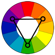
7. Does your color have a common denominator that harmonizes the scene ?
Stepped progressions of hue, intensity, and value give harmony to natural light. The elements of your painting should also harmonize. To accomplish this, use “mother colors” that influence, in varying degrees, all the other colors (see Color Harmony, above). Keep your closely related progressions of hue and intensity within a given mass, just as you do with closely related value progressions (see critique question 1).

'그림공부' 카테고리의 다른 글
| ( 그림 공부 ) Alla Prima Painting 5 Tips (0) | 2022.04.17 |
|---|---|
| ( 그림 공부 ) Keiko Tanabe의 수채화 (0) | 2022.04.10 |
| ( 그림 공부 ) 그림자 분석 (0) | 2022.03.29 |
| ( 그림 공부 ) 야외사생에서 구름을 그리는 방법 (0) | 2022.03.20 |
| ( 그림공부 ) 야외사생에서 좋은 구도를 위한 조언 (0) | 2022.02.10 |


