
Pat Fiorelle라는 화가가 쓴 글을 옮긴다.
( 번역은 구글 번역, 영어 원문은 맨 뒤에 )
===========================================================
매력적인 정물화를 위한 7가지 팁
Pat Fiorello 지음
절대적인 "규칙"은 없으며 장르에 관계없이 좋은 구성을 만드는 데 필요한 많은 생각이
여전히 여기에 적용됩니다. 정물화의 훌륭하고 자유로운 측면은 예를 들어 풍경화와 달리
전체 장면을 디자인한다는 것입니다. 풍경화는 이미 있는 것을 편집합니다.
그렇게 많은 창의적 자유를 갖는 것은 신나는 일이 될 수 있지만, 위압적일 수도 있습니다.
제 그림 영감을 위해 정물화를 설정하면서 제가 생각하는 몇 가지 사항은 다음과 같습니다.

1. 이 그림에 대한 의도는 무엇입니까? 무엇을 말하고 싶습니까?
이 그림을 그리는 데 왜 흥분합니까? 구성의 개념, 아이디어, 주제 또는
특정 "스타"는 무엇입니까? 조립하는 물체 컬렉션으로 말하고 싶은 이야기가 있습니까?
문자 그대로의 이야기일 필요는 없습니다. 색상, 모양 또는 질감의 관계에 대한 것일 수 있습니다.
저는 일반적으로 정말 흥분되는 요소 하나를 선택합니다.
예를 들어 화려한 꽃병이나 꽃 모음입니다. 그런 다음 그 주변으로 배열을 구성합니다.
상자 밖에서 생각하고 개인적인 설정을 자유롭게 하거나(예: 좋아하는 컬렉션이나
집에 의미 있는 물건이 있습니까?) 예상치 못한 것(작은 도구, 기념품, 열쇠, 주방 용품)을 만들 수도 있습니다.
2. 스토리를 전달하기 위해 어떤 대비를 강조하고 싶으신가요?
예술은 모두 대비에 관한 것이고, 우리는 그것을 표현할 수 있는 많은 방법이 있습니다.
주요 대비는 색상인가요? 예를 들어, 주로 파란색 모양에 보색인 주황색이
약간 대비되는 것인가요? 아니면 명암의 대비인가요?
밝은 것에서 매우 어두운 것까지 전체 값 범위를 사용하면 극적인 분위기를
전달할 수 있는 반면, 더 가까운 값 범위는 더 미묘하고 민감한 느낌을 암시할 수 있습니다.
(저는 종종 어둡고 밝은 배경을 모두 사용하여 정물 사진을 찍어서 얼마나 다른지 확인합니다.)
높은 채도 색상 대비 낮은 강도의 배경의 대비를 강조하고 싶으신가요?
단단한 요소 대비 부드럽고 반짝이며 반사되는 요소 대비 둔한 질감도 디자인에 흥미를 더할 수 있습니다.
크기는 또 다른 대비가 될 수 있습니다. 섬세한 것은 많은 무거운 품목에 생명력을
불어넣을 수 있습니다. 스토리에 가장 필수적인 대비는 무엇인가요?
간단한 상기: 설정이 완료되었다고 생각되면 "밝은 부분이 있나요? 어두운 부분?
밝은 부분? 둔한 부분?"이라고 물어보세요. 네 가지 기본 사항을 모두 갖추면 흥미로운 대조를 이룰 수 있습니다.
3. 조명이 핵심입니다. 제 관심의 중심은 일반적으로 밝습니다.
저는 시청자의 눈이 그곳으로 향하기를 원하며, 일반적으로 그림자가 아닌 곳에
두기를 원합니다(그림이니까 그럴 수도 있지만요!). 일관된 광원을 설정하고 유지하세요.
브로드웨이 세트 디렉터라고 생각해보세요. 무엇/어디를 강조하고 싶으신가요?
조명은 또한 장면 전체에 통일성을 부여합니다.
공통된 온도와 강도를 제공합니다(예: 강한 스포트라이트 대 확산된 자연광).
4. 정물을 '사물'의 모음으로 생각하는 대신 구성 주변의 눈의 움직임에 대해
생각하는 것이 중요합니다. 시청자의 눈은 어떻게 흐를까요?
왼쪽에서 오른쪽, 오른쪽에서 왼쪽, 앞에서 뒤로, 위에서 아래로?
시청자의 눈은 그림의 어디로 들어가고, 관심의 중심에 도달하기 위해 어떻게 이동하여 그림 속에 머물게 될까요?
이는 풍경화나 인물화를 디자인하는 것과 다르지 않습니다.
원형, S자형 또는 L자형과 같은 모든 디자인 전략은 정물화에도 적용할 수 있습니다.
빛의 방향과 흐름은 강력한 디자인 요소가 되며, "무대" 전체에서 시청자의 눈을
유도하는 데 도움이 될 수 있습니다. 그림자는 모양이 되며, 눈을 그림 속에 유지하는 데
도움이 될 수 있으며, 흘러나오지 않습니다. 색상의 반복은 캔버스 주변에서
누군가의 눈을 움직이는 데 도움이 되는 또 다른 장치입니다.
그리고 물론, 줄기, 칼, 리본 등과 같은 장면의 요소에서 나오는 방향선은
시각적 "포인터" 역할을 하여 눈을 안내할 수 있습니다.
5. 배치와 포함할 내용을 고려합니다. 저는 "별"로 시작하여 캔버스에서
원하는 위치를 상상한 다음, 그에 따라 객체를 배치합니다.
"사물"이 아닌 "색상 모양"을 생각하면 문자적 사고를 벗어나 모양을 모으는
사고방식으로 전환하는 데 도움이 될 수 있습니다.
"유사한 값"을 그룹화하여 장면에서 단편화보다는 견고성을 위해 더 적은 더 큰 모양을 만듭니다.
초점을 정한 후에는 원래 그림에 대한 의도와 관련하여 어떻게 작동할지
항상 판단하면서 추가, 제거, 이동, 겹치면서 놀 것입니다.
자신의 반응에 주의를 기울이십시오. 이 중 일부는 당신에게 "적절하게" 느껴질 것입니다.
때로는 무언가를 제거하는 것이 무언가를 추가하는 것만큼 도움이 된다는 것을 기억하십시오.
핵심 요소 주변에 약간의 여유 공간/조용한 공간이 필요합니다.
6. 다양성을 갖춘 반복은 중요한 디자인 원칙입니다.
같은 크기와 모양의 병과 과일 한 조각은 피하십시오. 너무 지루합니다.
(대조의 중요성을 기억하세요!). 두 개 대신 복숭아 한 개나 세 개를 넣는 등 고르지 않은 양을
사용하는 것을 선호하는데, 두 개를 겹쳐서 하나의 큰 모양으로 읽히지 않는 한
더 정적이고 예측 가능한 느낌이 들 수 있습니다.
장미와 같은 동일한 유형의 아이템이 여러 개 있는 경우 모양, 크기, 방향을
다양하게 하려고 합니다. 흥미를 더하기 위해 서로 다른 방향을 향하게 합니다.

7. 장면의 형식 또는 방향을 가지고 놀아보세요. 수직, 수평 또는 정사각형이
장면의 의도와 만들고 있는 눈의 움직임 흐름에 가장 적합할까요?
글라디올러스가 있는 길고 얇은 꽃병이 있다고 가정해 보겠습니다.
수직 형식으로 읽으면 더 잘 읽힐 수 있으며, 이는 "별"의 높이 방향을 강조합니다.
다시 말하지만, 이는 개인적인 예술적 선택이지만, 수평으로 자동으로 기본 설정하기보다는
적극적으로 다양한 형식을 고려하세요. 이를 고려하는 것은 쉽습니다.
설정 사진을 찍고 잘라내어 가장 흥미로운 것과 원하는 느낌을 전달하는 데
가장 좋은 선택이 무엇인지 확인하세요.
이러한 고려 사항을 공유하는 것은 규칙이나 "해야 할 일"을 제시하려는 것이 아닙니다.
왜냐하면 그것은 여러분이 만드는 예술이기 때문입니다.
그러나 의도적인 디자인 감각으로 정물을 생각해보세요. 대비, 분위기 및 움직임을
그리면 정물을 단순히 물체 모음을 그리는 것에서 응집력 있고 강력하며 잘 구성된
예술 작품을 만드는 것으로 격상시키는 데 도움이 됩니다.

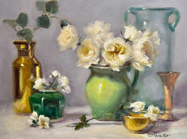
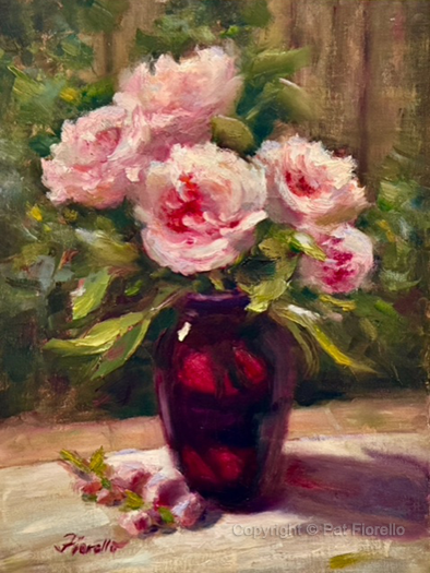


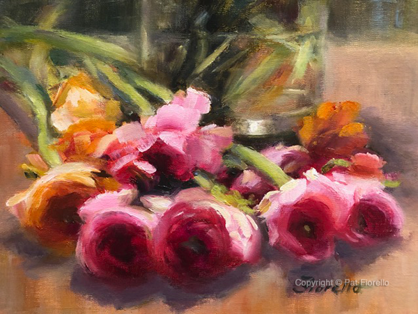

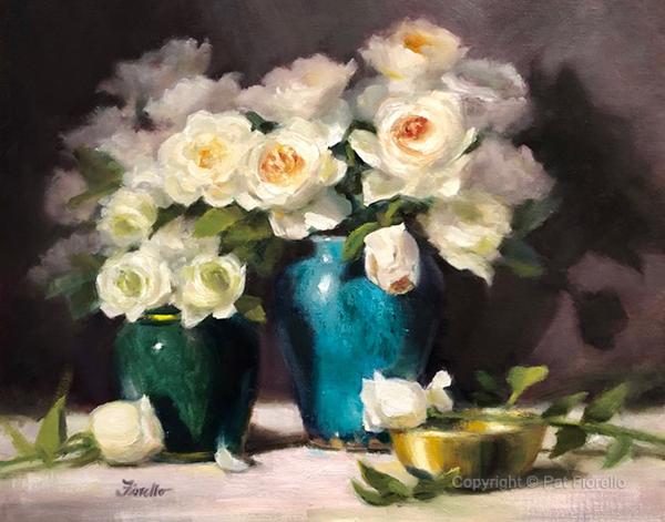

7 Tips for Arranging a Compelling Still Life
by Pat Fiorello
A frequent request I get in my workshops is, “Can you share how to set up a still life?”
There are no absolute “rules” and much of the thinking for creating any good composition, regardless of the genre, still applies here. The wonderful and freeing aspect of still life is that you are designing the whole scene, as compared to a landscape, for example, where you are editing what’s already there. It can be exciting to have that much creative latitude, but it can also be intimidating. Here are some of the things I think about as I arrange still life set ups for my own painting inspiration.
1. What is your intention for this painting? What do you want to say? Why are you excited to paint this painting? What is the concept, idea, theme, or specific “star” of your composition? Is there a narrative you want to tell with the collection of objects you are assembling? It does not need to be a literal story. It might be about the relationship of colors, shapes, or textures.
I typically take one element I am really excited by – maybe a gorgeous vase or a collection of flowers – and then build the arrangement around that. Feel free to think out of the box and make your set up personal (i.e. do you have favorite collections or meaningful pieces in your home) or perhaps something unexpected – small tools, memorabilia, keys, kitchen items.
2. Which contrasts do you want to emphasize to tell your story? Art is all about contrasts and we have many ways we can express that. Is the main contrast about color? For example, dominantly blue shapes with a small contrast of complementary orange? Or contrast of value?
Playing the full value range from light to very dark can convey a dramatic mood, while a closer value range can suggest a more subtle and sensitive feeling. (I often take photos of my still life set ups with both a dark and light background to see how different they feel.)
Do you want to emphasize a contrast of high chroma color vs. lower intensity background? Even contrasting textures – hard elements vs. soft, shiny and reflective vs. dull – can add interest to your design.
Size can be another contrast. Something delicate can give a spark of life to a lot of heavy items. Which contrasts are most essential to your story? A quick reminder: Once you think you have your set up ask, “Do I have some area that’s light? Dark? Bright? Dull? If you have all four bases covered, you’re assured of some interesting contrast.
3. Lighting is key. My center of interest is typically well lit. That’s where I want the viewer’s eye to go, typically not in the shadows (although you could do that – it’s your painting!). Set and keep a consistent light source. Think of yourself as a Broadway set director. What /where do you want to emphasize? Light also imparts unity across your scene. It provides a common temperature and intensity (i.e. strong spotlight vs. diffused natural light).
4. Rather than thinking of your still life as a collection of ‘things,” it’s important to think about eye movement around the composition. How will the viewer’s eye flow – left to right, right to left, front to back, top to bottom? Where will the viewer’s eye enter the painting, how will it travel to get to the center of interest and be kept in the painting?
This is no different than designing a landscape or figure painting. Any design strategies, such as circular, S-shaped, or L-shaped, can apply to still lifes too. The direction and flow of the light becomes a strong design element and can help direct the viewer’s eye throughout the “stage.” Shadows become a shape and can help keep the eye in a painting rather than flowing out. Repetition of color is another device that can help move someone’s eye around your canvas. And, of course, directional lines from elements in your scene, like a stem, knife, ribbon, etc., can guide the eye by acting as visual “pointers.”
5. Consider placement and what to include. I start with the “star,” envision where I want that on the canvas, and then place objects in relation to that. Thinking “shapes of color” rather than “things” can help get beyond literal thinking and get you into the mindset of massing shapes.
Try to group “like values” together to create fewer bigger shapes for more solidity rather than fragmentation in your scene. Once I’ve determined my focus, I will play, adding things in, taking things away, moving them, overlapping them, always judging how that will work relative to my original intention for the painting. Pay attention to your own response. Some of this will just “feel” right to you. Remember, sometimes removing something is as helpful as adding something. You need some breathing room/quiet space surrounding your key elements.
6. Repetition with variety is an important design principle. Try to avoid a jar and a piece of fruit of the same size and shape. Too boring. (Remember the importance of contrast!). I prefer using uneven amounts, e.g. including one or three peaches, instead of two, which might feel more static and predictable, unless I overlap the two peaches in such a way that they read as one larger shape.
If I have multiples of the same type of item, say roses, I try to vary their shape, size, and orientation. Have them face in different directions for added interest.
7. Play with the format, or orientation of the scene. Would a vertical, horizontal, or square best fit the intention of the scene and flow of eye movement you are creating? Say you have a long, thin vase with gladiolus. That might read better in a vertical format, which would emphasize the height direction of your “star.”
Again, this is a personal artistic choice, but actively consider different formats, rather than automatically defaulting to horizontal. It’s easy to consider this. Just take photos of your set up and crop in to see which seems most exciting to you and the best choice to deliver on the feeling you’re going for.
I share these considerations not to give any rules or “have to’s,” because it’s your art to create. But I encourage you to think of still life with an intentional design sense. Painting contrast, mood, and movement will help you elevate your still lifes from merely painting a collection of objects to creating a cohesive, powerful, and well composed work of art.
'그림공부' 카테고리의 다른 글
| ( 그림공부 ) 인물화 그리는 방법에 대해서 (0) | 2025.04.03 |
|---|---|
| ( 그림공부 ) 야생화와 풀을 잘 그리기 위한 7가지 조언 (4) | 2025.03.18 |
| ( 그림공부 ) 과슈( Gouache) 는 어떤 물감인가 (2) | 2025.02.05 |
| ( 그림공부 ) 큰 그림을 그리는 테크닉: 3가지 문제점과 해결 방법 (3) | 2025.01.25 |
| ( 그림공부 ) Red color에 대하여 (3) | 2025.01.18 |


