미국화가 Christine Lashley 가 쓴 글을 옮긴다.
그녀의 그림은 썩 내 취향은 아니지만 그림 공부에는 도움이 될 듯하다.
사실 이론보다도 실제 그림을 많이 그려보는게 훨씬 중요하지만 이렇게
그림과 관련된 글이나 그림을 모으는 것도 어쩌면 우표 수집과도 같은
취미라고 할 수 있을 것이다.
( 번역은 구글 번역, 영어 원문은 맨 뒤에 )
--------------------------------------------------------------------------------------------
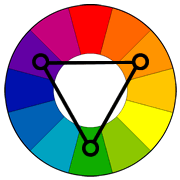
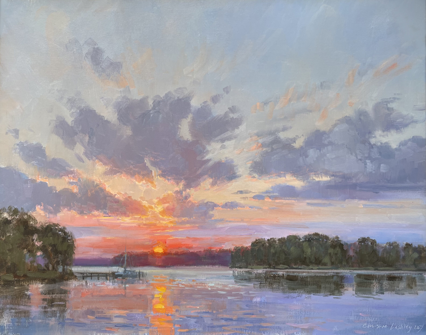
사례 연구 1: waterscape
문제: 해안과 조수 습지를 포착하기 위해 큰 규모로 작업하고 싶었지만,
제가 찍은 참고 사진은 너무 파랗고 지루한 수평선만 보여주었습니다.
직접 보니 부드러운 질감, 여러 겹, 물, 풀, 반짝이가 보였습니다. 눈부신 빛과
강한 바람 때문에 현장에서 작업하기는 불가능했습니다.

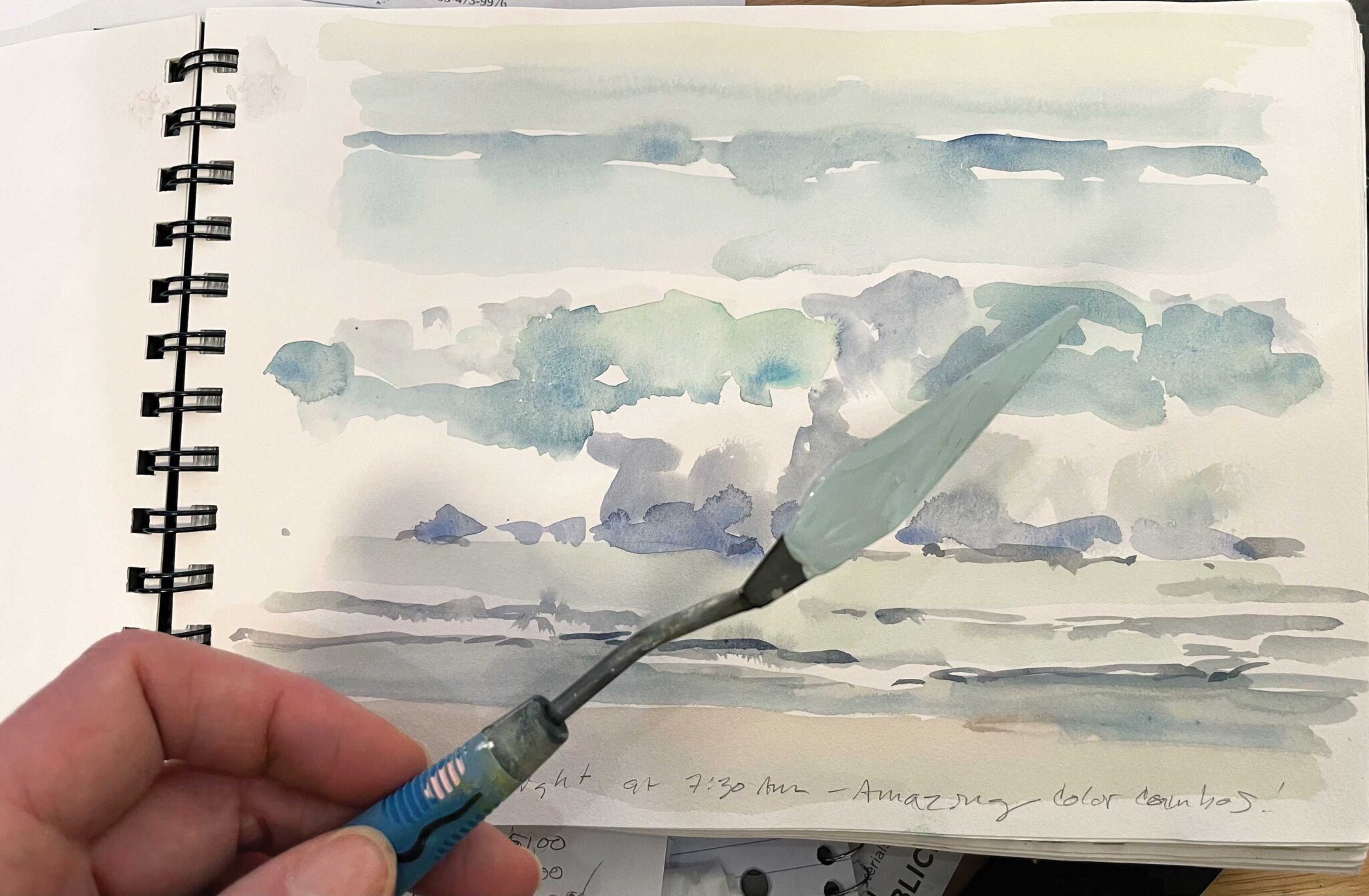
해결책: 현장에서 비디오를 찍어서 움직임을 기록하고 세부 사항을 줄였습니다.
또한 "Wave Study"에서 색상과 값을 포착하기 위해 모양이 아닌 빠른 색상 점
접근 방식을 사용했습니다. (위의 사진에서 팔레트 나이프에 있는 제가 직접 섞은 오일 믹스를
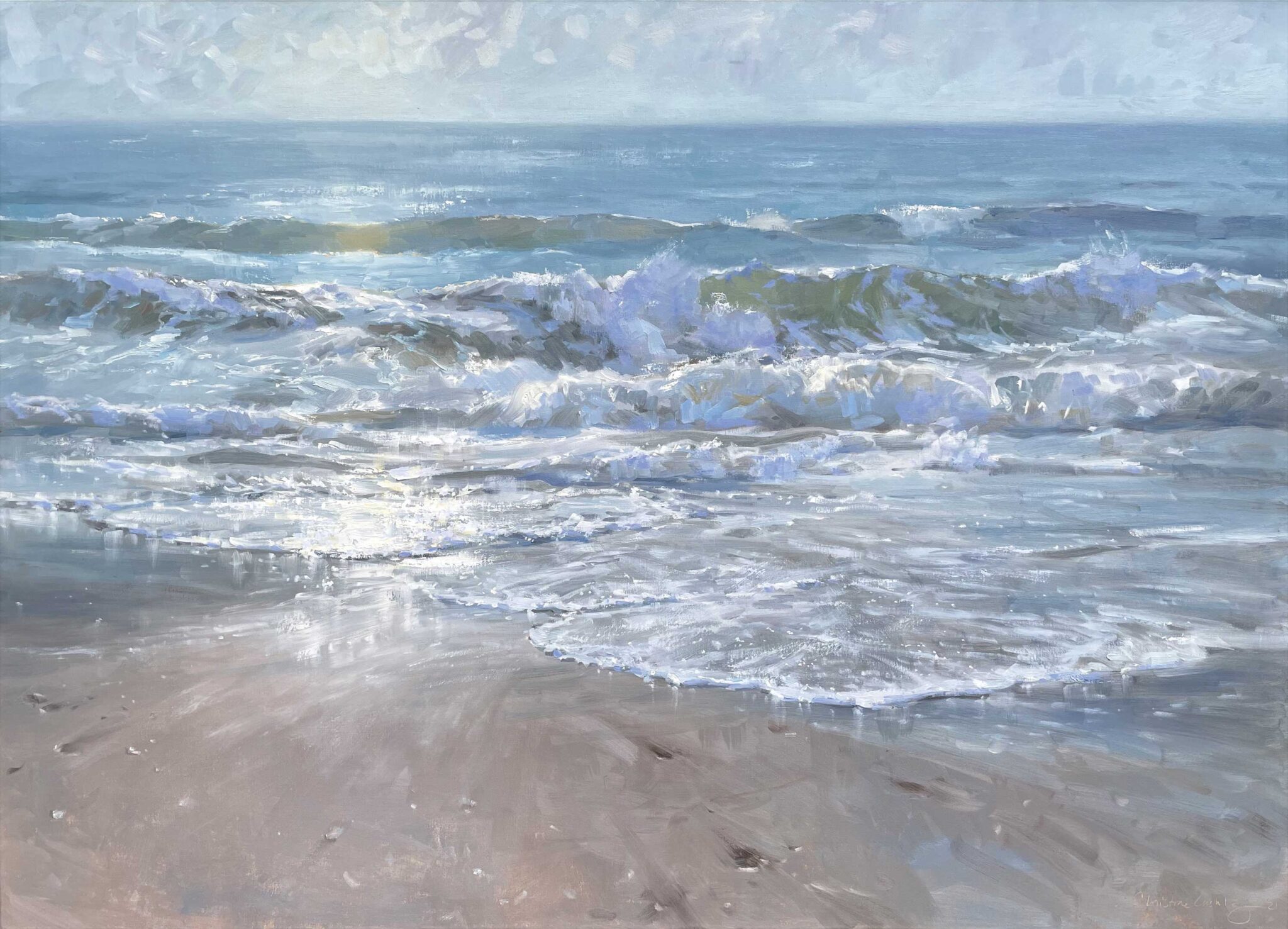
볼 수 있습니다. 아래에서 더 큰 그림 "Glisten"의 색상을 맞추는 데 사용했습니다.)
제가 본 해안 모양은 단순했기 때문에 스튜디오로 돌아와 캔버스의 큰 모양으로
바로 가서 희석된 오일의 느슨하고 대담한 워시로 값과 디자인을 작업했습니다.
페인트는 해안과 물을 암시하는 품질이었고 디자인을 거의 즉시 볼 수 있었습니다.
첫 번째 워싱에서는 주로 코브라의 군청색과 투명한 적색 산화물을 사용했습니다.
큰 합성 하우스 브러시는 페인트 흐름과 속도를 높이는 데 도움이 되었습니다.
모양이 너무 단순했기 때문에 해안선 곡선과 수평선에 특별한 주의를 기울였습니다.
1~2인치의 작은 변화가 큰 영향을 미칩니다. 시청자를 장면에 초대하고 싶었지
압도당하게 하고 싶지 않았습니다. 디자인과 명암이 마음에 들 때까지 모든 것을
다시 작업했는데, 하루나 이틀이 걸렸습니다.
그다음, 더 두꺼운 오일 페인트를 겹겹이 칠했습니다(희석제나 매체를 추가하지 않음).
색상 연구와 워시 언더 페인팅 명암에 맞는 페인트를 대량으로 미리 섞었습니다.
여분의 페인트 색상을 저장하고 동결했습니다. 큰 아트에는 페인트가 많이 필요하고
나중에 혼합을 맞추기 어려울 수 있습니다. 젖은 페인트를 남겨두면 더 많은 페인트를
섞거나 영역을 보정하는 데 편리합니다.
하늘, 물, 모래 등 광대한 영역의 대부분을 "모두 하나로, 젖은 상태"
또는 즉 단번에 완성하려고 했습니다. 첫 번째 레이어가 마르면 풀, 모래 질감,
물 하이라이트를 추가했습니다. 이런 식으로 언더페인팅 구성에 더 많은 시간을 할애하는
것은 저에게 매우 보람 있는 일이어서 지금은 야외 그림에도 이렇게 합니다.
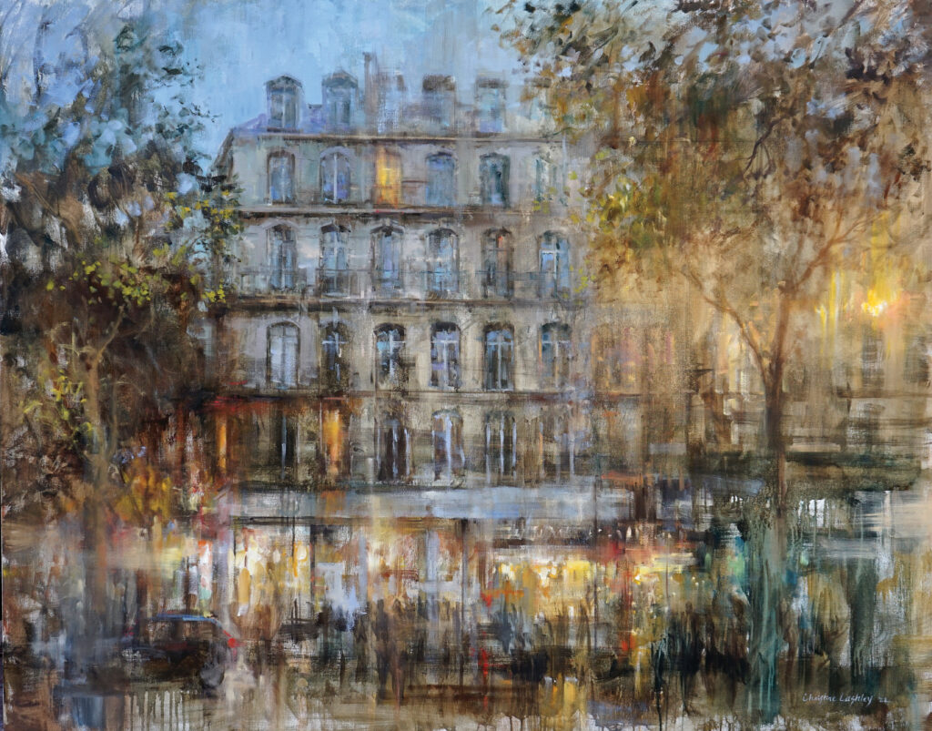
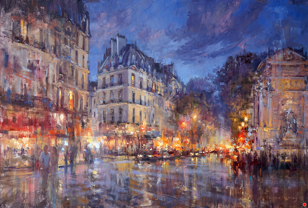
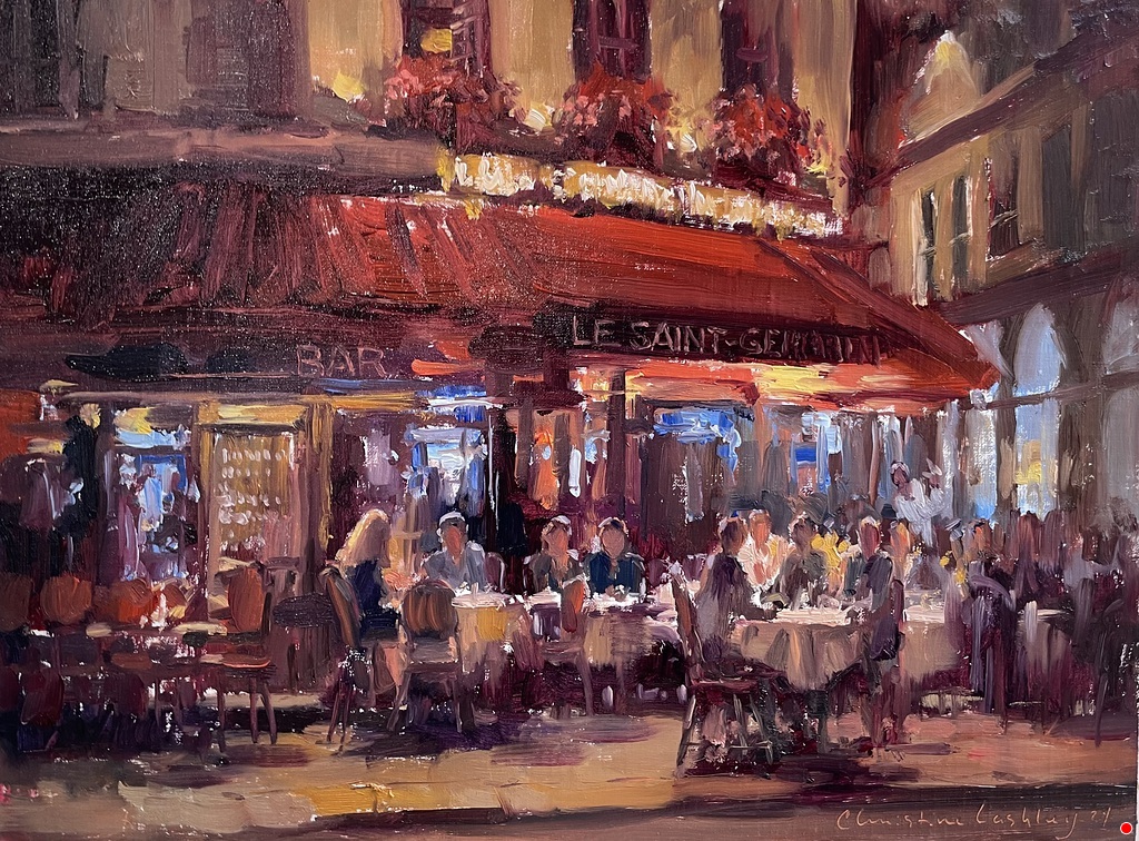
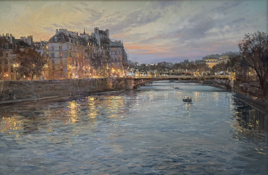
사례 연구 2: 파리
문제: 파리의 더 큰 그림을 그리고 싶었지만 지난 여행에서 얻은 좋은
참고 자료가 부족했습니다.
건물에 비치는 진주빛 빛이 제 영감의 원천이었습니다. 제 사진에는 엄청난
수준의 세부 묘사가 포함되어 있었고 칙칙하고 영감을 주지 못했습니다.
작업할 야외 스케치와 스터디가 몇 개 있었지만 대부분 제가 탐구하고 싶었던 뉘앙스가
빠져 있었습니다. 매혹적인 파리 회색에 대한 기억이 있어서 기뻤지만 앞으로 나아갈
적절한 참고 자료를 찾을 수 없었습니다.
해결책: 화가 친구들과 일주일간 방문하기 전에 현장에서 참고 자료를 최대한 수집할 수 있도록
명암에 대해 더 많이 조사했습니다. 먼저 에드거 페인의 작품을 컬러와 흑백으로 살펴보았습니다.
그의 산 풍경은 내가 파리에서 본 것과 비슷했는데, 넓은 빛과 그림자 영역과 하늘과 나란히 놓인
수직 형태가 있었습니다. Payne은 큰 덩어리로 같은 값을 사용한 다음,
다양성이 필요할 때 색상을 바꿉니다. 그룹화된 값은 색상을 시각적으로 돋보이게 하거나
매우 밝게 보이게 합니다. 저는 파리에서 일주일 내내 명암과 색상 관계를 찾았고 많은 아이디어와
유용한 연구를 가지고 집으로 돌아왔습니다.
"같은 명암, 색상 변경"이라는 아이디어는 새로운 것이 아니지만, 이 정보를 찾아내고
이 접근 방식을 연습하는 것이 필요합니다. 그림을 그릴 때 명암을 더 가깝게 옮기면
제대로 된 것이고, 더 많은 채도나 더 강한 명암을 선택하면 잘못된 것입니다.
명암을 그룹화하는 것은 매우 강력한 도구이며, 특히 예술이 커질수록 더욱 그렇습니다.
파리에서 명암을 다시 살펴보는 것은 스튜디오에서 창의성을 발휘하는 데 촉매가 되었습니다.
돌아온 후 제가 그린 첫 그림은 "파리 몰입"이었습니다. "파리 회색" 연구는 참고용으로
사용한 여러 스케치 중 하나였습니다. "파리 몰입"은 그 장면에 대한 문자 그대로의
해석이 아니라 회색 연구에 기반한 보다 추상적이고 직관적인 반응입니다.
모든 명암 연구를 마치고 직관적인 그림으로 돌아가는 것은 정말 신나는 일이었습니다.
사례 연구 3: 하늘
문제: 하늘은 크게 그리는 데 매우 즐겁지만 확대하면 "색상 증가"로 어려움을
겪을 수 있습니다. 제 "세레나데" 연구에서는 아름다운 새벽이 나오고,
색상이 큰 그림으로 잘 전달될 것이라고 생각했습니다.
하지만 더 큰 표면에 그대로 그리니 화려해 보였습니다.
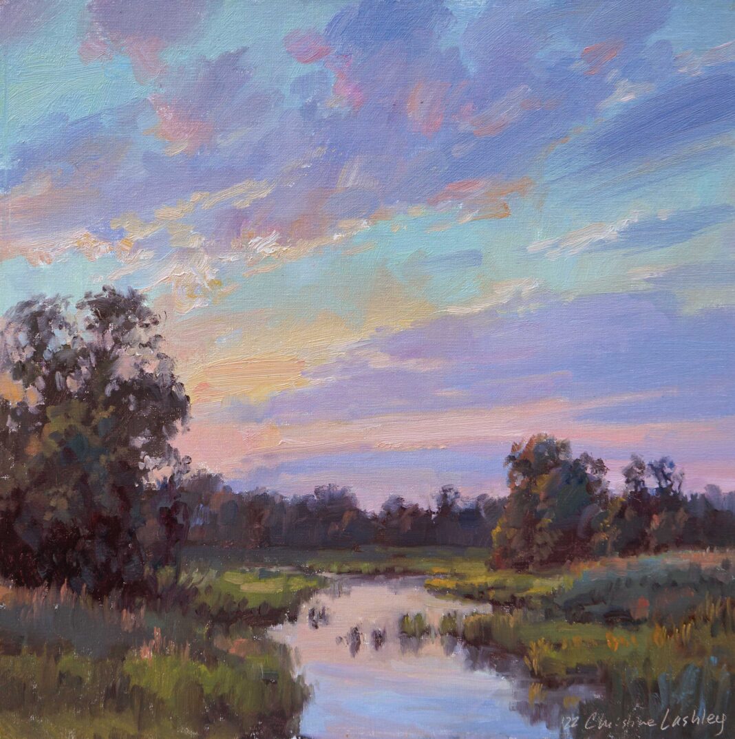
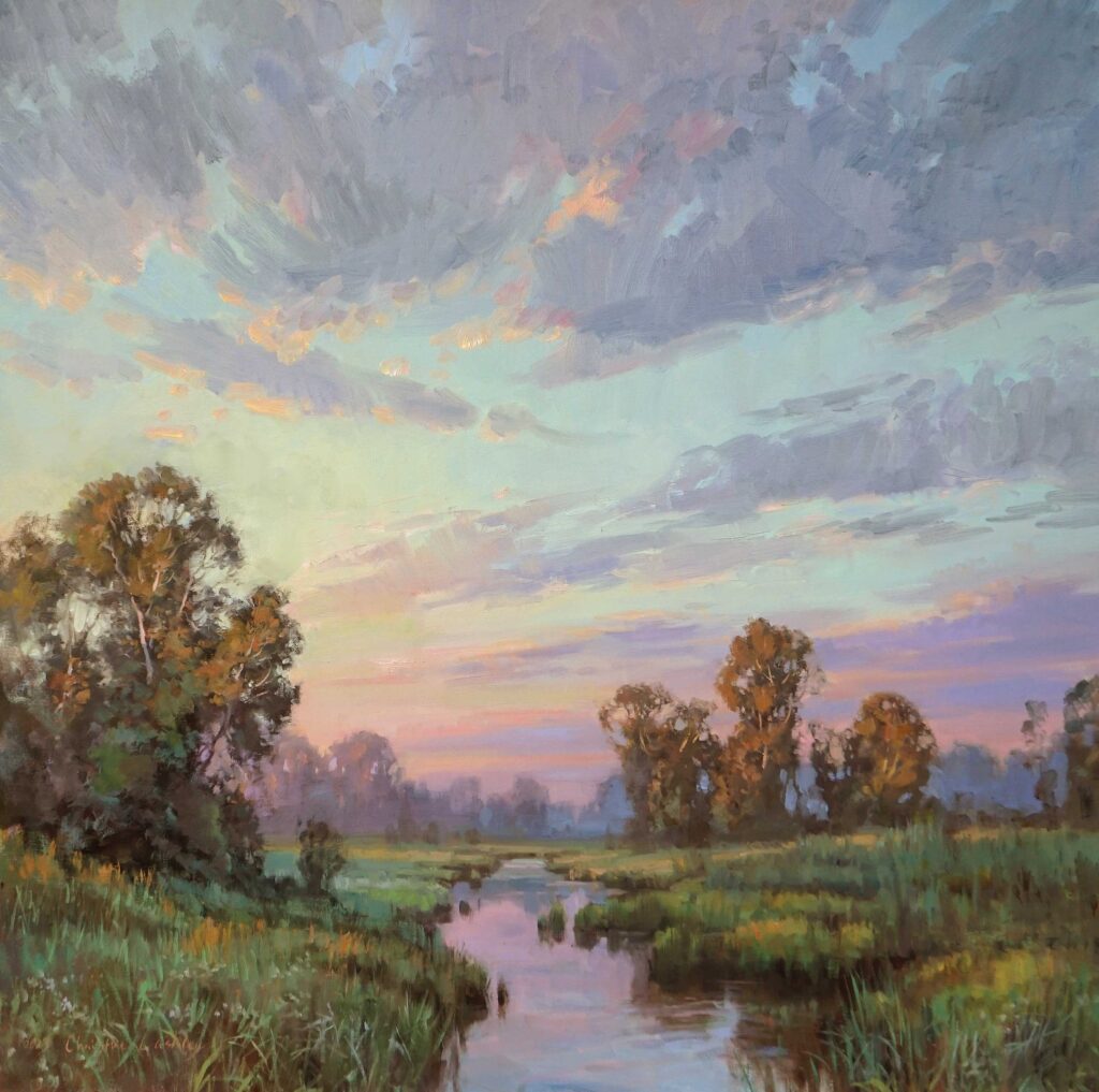
해결책: 모든 하늘 믹스를 덜 채도가 높은(회색) 색상으로 톤 다운하여 그림의 조화를 되찾았습니다.
또한 모든 하늘 색상의 반점이 주변으로 이동하도록 했습니다.
이러한 인상주의적 그림 방식은 "같은 명암, 색상 변경"이라는 아이디어와 관련이 있습니다.
따라서 적절한 명암이라면 하늘에 있는 모든 색상을 자유롭게 사용할 수 있습니다.
아트가 클수록 큰 믹스에서 색상은 더 회색이어야 합니다.
-------------------------------------------------------------------------------------------------------------------------------------------
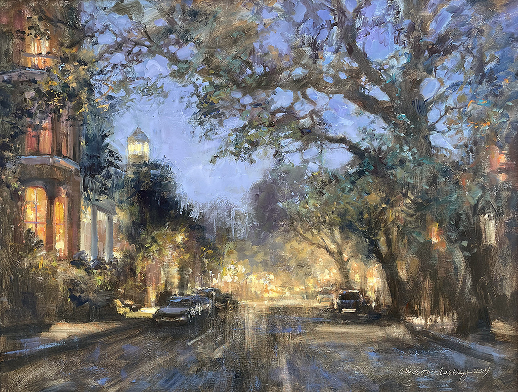
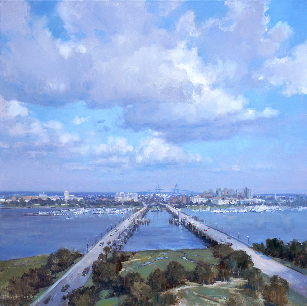
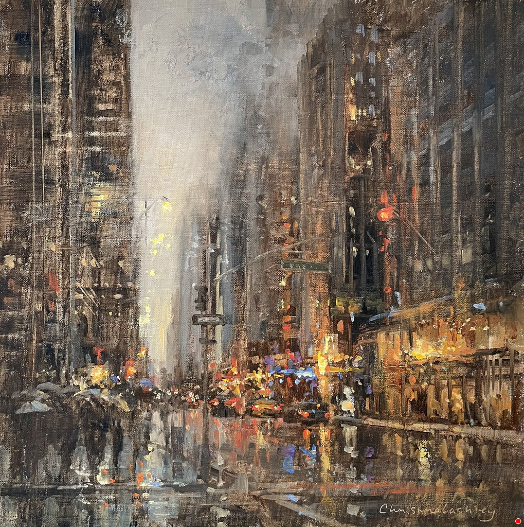
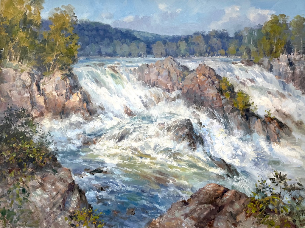
이 화가의 그림들 ( 그녀의 Homepage 에서 캡쳐해 왔음)


Case Study 1: Waterscape
Problem: I wanted to work large to capture the seashore and tidal marsh, yet the reference photos I took were too blue and showed me only boring horizontal lines. In person I saw soft texture, many layers, water, grasses, and glitter. With the blinding light and strong winds, full location studies were impractical.
Solution: On site I took video, which recorded movement and reduced detail. I also used a quick color dot approach — no shapes — to capture the colors and values in “Wave Study.” (In the photo above you can see the custom oil mixes on the palette knife I used to match colors for the larger painting “Glisten,” below.) The shore shapes I saw were simple, so back in the studio I went directly to big shapes on the canvas and worked on my value and design with loose, bold washes of thinned oils. The paint had a suggestive quality of the shore and water, and I could see the design almost instantly.
For the first washes I used mostly Cobra’s ultramarine blue and transparent red oxide. A large synthetic house brush aided paint flow and speed. Since the shapes were so simple, I gave special attention to the shoreline curves and horizon line. Small shifts of an inch or two have a big impact. I wanted the viewer invited into the scene, not overwhelmed. I reworked everything until I liked the design and value, which took a day or two.
Next, I layered thicker oil paint (with no thinner or medium added). I premixed large piles of paint matching my color studies and washy underpainting values. I saved and froze the extra paint color. Large art requires a lot of paint, and mixes might be hard to match later. Having wet paint dabs left over comes in handy for either mixing more paint or retouching areas.
I tried to complete much of the vast areas — sky, water, and sand — “all in one, wet” or alla prima. I added grasses, sand texture, and water highlights when the first layers were dry. Spending more time on the underpainting composition in this way has been so rewarding for me that I now do this for my plein air paintings too.
Case Study 2: Paris
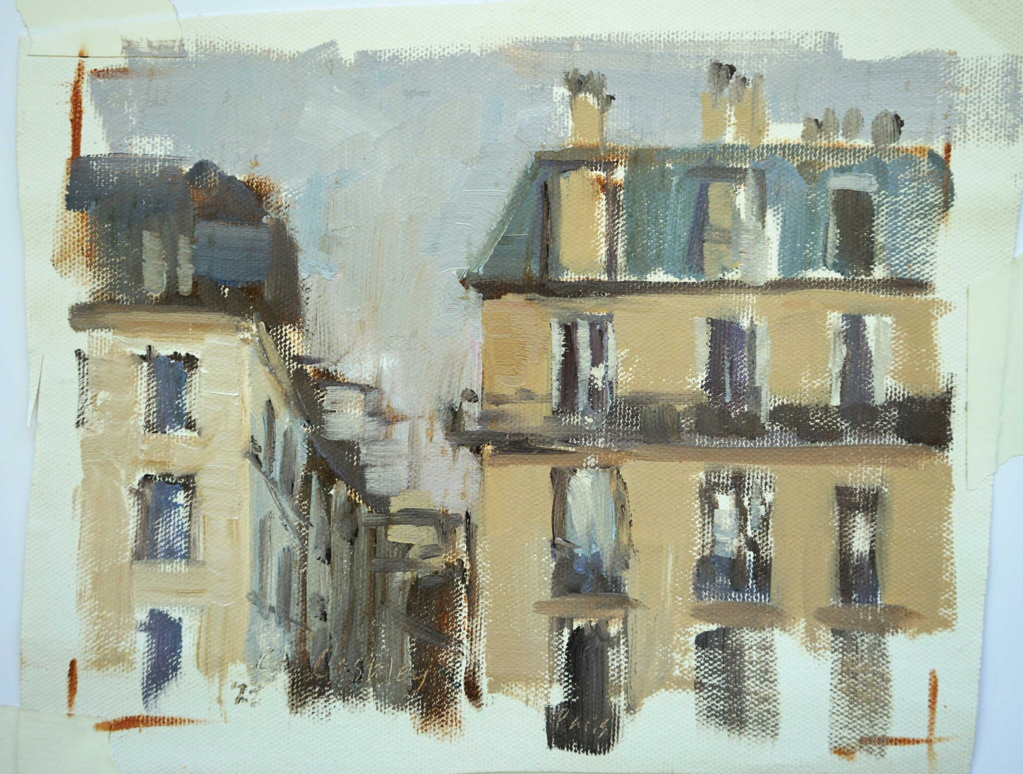
Problem: I wanted to do some larger paintings of Paris but lacked good reference material from past trips. The pearlescent quality of light on the buildings was my point of inspiration. My photos contained enormous levels of detail and were drab and uninspiring. I had some plein air sketches and studies to work from, but they were mostly missing the nuances I wanted to explore. I was glad to have the memory of those enticing Paris grays, but couldn’t find proper references to move forward.
Solution: Before a recent weeklong visit with painter friends, I researched more about value so I could maximize my reference-gathering on location. I started by examining Edgar Payne’s work in color and in black-and-white. His mountain scenes were similar to what I would see in Paris, with vast areas of light and shadow and upright forms juxtaposed to sky. Payne uses the same value in large masses, then shifts the color when he needs variety. Grouped values make the color optically pop or seem extra bright. I looked for value and color relationships all week in Paris and came back home with lots of ideas and useful studies.
The idea of “same value, shift the color” isn’t a new one, but it’s necessary to seek this information out and practice this approach. When I’m painting, I know I’m on track if I move my values closer, and I’m off track if I reach for more chromatic color or stronger value. Grouping value is a very powerful tool, especially as art gets larger.
Revisiting value in Paris was a catalyst for creativity back in the studio. My first painting upon my return was “Paris Immersion.” My “Paris Grays” study was one of several sketches used for reference. “Paris Immersion” is not a literal interpretation of the scene, but a more abstracted and intuitive response based on the gray study. Going back to intuitive painting after all that value study was really exhilarating.
Case Study 3: Sky
Problem: Skies are great fun to paint big but can suffer from “color gain” when enlarged. My “Serenade” study shows a beautiful dawn, and I thought the colors would transfer to a large painting well. But painted as-is on my larger surface, they looked garish.
Solution: Toning down all of the sky mixes to a less chromatic (grayer) color got the harmony back in my painting. I also allowed flecks of all the sky colors to migrate around. This impressionistic way of painting is tied to the idea of “same value, shift the color” — therefore I can feel free to use any color in the sky as long as it’s the right value. The larger the art, the grayer the color should be in the big mixes.
'그림공부' 카테고리의 다른 글
| ( 그림공부 ) 매력적인 정물화를 위한 7 가지 조언 (0) | 2025.02.12 |
|---|---|
| ( 그림공부 ) 과슈( Gouache) 는 어떤 물감인가 (2) | 2025.02.05 |
| ( 그림공부 ) Red color에 대하여 (3) | 2025.01.18 |
| ( 그림공부 ) Color story-ultramarine(소위 군청색 ) (3) | 2025.01.12 |
| ( 그림공부 ) Marking Light and Shade (0) | 2025.01.11 |


