
InsideArt Mail 에 Todd Bonita 라는 화가가 쓴 글이 있어 옮긴다.
그의 그림은 물론 내 취향이 아니지만 배울 점이 많이 있다.
( 번역은 구글 번역, 영어 원문은 맨 뒤에 )
-------------------------------------------------------------------------------------------
혹시 이 말을 들으셨다면, 멈춰주세요. 흔히 말하듯이 그림은 추상적인 디자인에 따라
성패가 결정됩니다. 따라서 구도는 학생들이 직면하는 가장 중요한 과제 중 하나입니다.
다행히 이 문제는 해결할 수 있습니다. 다음 항목들을 모두, 또는 일부만 체크해도
그림이 즉시 향상될 것입니다.
1. 동일한 형태/균일한 간격 교정.
인간의 시각은 대조와 다양성을 감지하도록 진화했습니다. 우리는 대조와 다양성을
가장 먼저 알아차립니다. 예술가로서 우리는 흥미를 유지하기 위해 이러한 요소들을
활용해야 합니다. "동일한" 형태가 너무 많거나 형태 사이의 간격이 너무 비슷하면
그림의 역동성이 사라지고, 시선이 그냥 스쳐 지나가는 정적인 구절만 남게 됩니다.

모양과 간격을 바꾸는 것을 소홀히 하면서 표현에만 집중하는 것은 너무나
자연스러운 일입니다. 그렇기 때문에 가끔은 그림을 그리는 것을 멈추고 무엇을
그리고 있는지 잊고, 크고 작은 모양들이 서로 어떻게 어울리는지(혹은 어울리지 않는지)
생각해 보는 것이 좋습니다.
2) 얕은 명암 배치를 피하세요.
색상과 별개로 명암을 구분하는 능력은 모든 기초적인 기술 중 가장 중요한 능력 중 하나입니다.
색상은 차치하고라도, 학생들은 명암을 서로의 관계로 판단하는 대신 고립된 상태로
보기 때문에 명암을 제대로 판단하는 데 어려움을 겪는다고 생각합니다.
적절한 명암 관계는 눈길을 끄는 그림과 지루한 그림의 차이를 만듭니다.
거의 일반적으로, 학생이 그림을 오래 그릴수록 명암이 스케일의 중앙에 가까워지는
경향이 있습니다. 이를 바로잡으려면 경계를 늦추지 말고 어두운 부분을 풍부하게 하고
밝은 부분을 밝게 할 적절한 위치를 의식적으로 찾아야 합니다.
명암 관계가 강하면 그림이 방 건너편에서도 벽을 뛰어넘는 것처럼 보이게 됩니다.
3) 명확한 초점이 없이 묘사된 영역을 많이 포함하지 마세요.
사물을 "믿게 보이도록" 만들려고 하다 보면 잊어버리기 쉽지만,
시각은 실제로 그렇게 작동하지 않습니다. 우리는 카메라가 보는 것처럼 보지 않습니다.
일반적으로 우리는 눈앞의 한 곳에만 초점을 맞추고, 주변 시야에 있는 다른 모든 것은
모호하거나 흐릿하게 보입니다. 이것이 우리가 주변의 모든 것에 압도당하지 않도록 하는 것입니다.
그림 전체에 걸쳐 너무 많은 디테일로 보는 사람을 압도하지 마세요.
더욱 세심하게 묘사된 디테일은 그림의 초점에 국한시키세요
(그리고 그 경우에도 잃어버렸다가 다시 찾은 가장자리를 인지하세요).

4) 시선이 그림 밖으로 나가지 않도록 하세요.
시선이 그림 안에서 계속 움직이도록 "눈의 길"을 만들어 주세요.
다시 말해, 어떤 선이나 형태적 경계도 보는 사람을 프레임 밖으로 이끌거나 "가리켜서는" 안 됩니다.
시선이 그림 밖으로 나가지 않도록 배경과 전경을 적절히 활용하세요.
5) 전경을 너무 많이 차지하지 마세요.
저는 이것을 "밀접 대화자 증후군"이라고 부릅니다. 방금 만난 사람과 대화를 나누는데,
상대방이 당신에게 말을 걸지 않고 몸을 기울여 말을 걸면서 개인적인 공간을
침범하는 경우를 본 적이 있나요? 과하게 긴장된 전경이 바로 그런 경우입니다.
좋은 전경은 좋은 대화가처럼 당신을 그림과의 "대화" 속으로 더욱 깊이
끌어들여야 합니다. 특별한 이유가 없다면 전경에 너무 많은 주의를 끌지 마세요.
시선을 분산시키거나 "안쪽" 문 앞에 장애물을 설치하지 마세요.
전경의 주된 역할은 그림 속 공간으로 들어가는 입구 역할을 하는 것입니다.
전경을 그렇게 다루면 디자인 목적으로 미묘한 방식으로 활용할 수 있습니다.
충분히 깔끔하다면, 벡터와 도형을 사용하여 전경을 나누고 패턴을 만들어 시선을
중앙이나 가장 강렬한 초점이 있는 곳으로 유도할 수 있습니다.
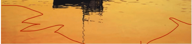
예를 들어, 메인 주에 정박한 어선을 그린 유화 "황금의 항구"(페이지 상단)에서
저는 전경을 단순하게 유지하면서도 절제된 대각선과 전경 공간의 미묘한 색상 및
명도 변화 등 특정 디자인 요소에 활용하려고 노력했습니다.
아래쪽 두 모서리를 붉은색과 주황색으로 가려 시선을 그림에서 벗어나지 않도록 했습니다.
같은 모양이더라도 다양성을 확보하여 수정했습니다.
왼쪽 모서리의 큰 붉은색과 주황색 삼각형은 오른쪽의 작은 삼각형보다 시각적으로
더 큰 무게감을 주지만, 모양은 거의 같습니다. 전경의 모서리를 닫으면 일종의 그릇 효과가 나타나
그림의 중앙 영역을 조용히 "덮어줍니다"(아래 곡선 녹색 선 참조).

다양한 크기와 모양의 부드러운 물결 모양(위의 파란색 악센트와 회색 곡선)을 통해
초점(보트)을 "가리키는" 곡선 대각선을 몇 개 추가했습니다.
파도의 각도를 조절하여 보는 사람을 주요 초점(가장 가까운 보트와 그 주변을 둘러싼 이웃 보트)으로
끌어당겼습니다. 또한 강렬한 명암 대비를 위해 햇살이 비치는 물과 보트 사이의 대비를 최대화했습니다.
"이 다섯 가지만 하면 멋진 그림이 나올 거야"라고 말하기는 쉽지만,
그림을 그리는 동안에는 기억하기가 훨씬 어렵습니다. 해야 할 일과 하지 말아야 할 일을
미리 적어둔 체크리스트를 눈앞에 두고 있으면 도움이 될 수 있습니다.
작업을 멈춘 후 다시 돌아와 이런 것들을 파악하는 것이 훨씬 쉽습니다.
적어도 유화에서는 "그저 평범한 그림"과 훌륭한 작품의 차이를 만들어낼 수 있는
몇 가지 사려 깊은 변화를 주기에 너무 늦은 때는 없습니다.
============================================================================
Stop me if you’re heard this one, but as they say, paintings live or die based on underlying abstract design. Composition, therefore, is among the most important challenges students face. The good news it’s fixable – check all, or even some of the following boxes, and your paintings will improve immediately.
- Correct for same-same shapes / even spacing.
Human sight evolved to detect contrast and variety; it’s what we notice first. As artists we need to work with that to keep interest. Too many “same-same” shapes or too-similar intervals between shapes kills your painting’s dynamism, creating static passages the eye skips right over.
It’s all-too natural to concentrate on rendering while neglecting to vary your shapes and their spacing. That’s why it’s a good idea to stop once in a while, forget what you’re making a painting of, and consider how your big (and small) shapes are working (or not) in relation to each other.
2) Avoid a shallow value plan. The ability to see value apart from color is one of the most important of all foundational skills. Color aside, I think students sometimes struggle to judge values correctly because they’re looking at them in isolation instead of judging them in relation to one other.
Proper value relationships make the difference between eye-catching paintings and dull ones. Almost as a rule, the longer a student works on a painting, the closer to the center of the scale their values tend to move. To correct for this, you have to stay on your guard for it and consciously identify appropriate places to enrich your darks and brighten your lights. Strong value relationships ensure a painting will jump of the wall, as it should do, from all the way across the room.
3) Don’t include too many rendered areas devoid of a definitive focal point. It’s easy to forget when you’re trying to make things “look believable,” but vision doesn’t really work like that. We do not see the way cameras see.
Generally, we focus our eyes at one single area in front of us, while everything else (in our peripheral vision) stays vague or blurry. That’s what keeps us from being overwhelmed by what’s all around us. Don’t drown your viewers in too much detail all over the painting. Confine more carefully rendered detail to the focal point of the painting (and even then be cognizant of lost and found edges).
4) Prevent the eye from being led out of the painting. Design to create a “path for the eye” that keeps the gaze moving within it. In other words, none of your lines or shape-edges should lead or “point” the viewer outside of the frame. Correct for this with backgrounds and foregrounds that actively prevent the eye from leaving.
5) Don’t crowd the foreground. I call this the “close talker” syndrome. You know when you’re having a conversation with someone you’ve just met, and the person keeps invading your personal space by leaning in and talking at you instead of to you? Busy foregrounds are like that.
A good foreground, like a good conversationalist, should lead you further into the “dialogue” with the painting. Unless there’s a compelling reason, avoid calling too much attention to the foreground; don’t distract the eye or put up barriers in front of the “in” door.
The foreground’s primary job is to be the entryway into the space of the painting. Treating it as such enables you to consider subtle ways of using it for design purposes. If its uncluttered enough, you can divide and pattern the foreground with vectors and shapes that lead the eye toward the middle ground and wherever your strongest focal point is.
For example, in my oil painting of a Maine fishing boat at anchor titled “Harbor of Gold” (top of page), I tried to keep the foreground simple while utilizing it for certain elements of design, including understated diagonals and slight color and value variations in the foreground space.
I closed off the two bottom corners with a red-orange glow (discouraging the eye from leaving the picture). I corrected for same-same shapes by ensuring variety – the larger red-orange triangle in the left corner has more visual weight than the smaller one on the right, even though they’re roughly the same shape. Closing off the corners of the foreground creates a sort of bowl effect, quietly “cupping” the central area of the painting (see curved green line below).
I added a few curving diagonals, “pointing” toward the focal point (the boat) via gentle wavelets of varied size and shape (blue accents and gray curved line above). I angled the waves to pull the viewer toward the main focal point (the closest boat and its supporting neighbors). I also maxed out the contrast between the sunlit water and the boat to ensure a strong value plan.
I know it’s easy to say “just do these five things” and your paintings will be awesome. It’s a lot harder to remember while you’re painting. It can be good to literally have a checklist of do’s and don’ts in front of you.
It’s much easier to go back and catch this stuff after you’ve stopped working. It’s never too late, with oils at least, to go back in with a few thoughtful changes that might make the difference between “just another painting” and a knockout.
'그림공부' 카테고리의 다른 글
| ( 그림공부 ) 느슨하게 그리는 방법- How to Paint Loose (2) | 2025.12.04 |
|---|---|
| ( 그림공부 ) 모네가 강을 옮길 때 (When Monet moved a River) (7) | 2025.11.28 |
| ( 그림공부 ) 그림이 죽은 것처럼 느껴지는 3가지 이유( The Top 3 Reasons Your Paintings Feel Dead) (4) | 2025.10.07 |
| ( 그림공부 ) 수채화가의 물과의 사랑과 증오의 관계( Watercolorists’ Love-Hate Relationship With Water) (6) | 2025.09.28 |
| ( 그림공부 ) How I Paint Trees with Character ( 캐릭터가 있는 나무를 그리는 방법 ) (2) | 2025.09.25 |


