Julio Reyes 란 미국화가가 Inside Art 에 쓴 글이 있어 옮긴다.
나도 처음 그림 그리기 시작할 때 목탄으로 크로키를 했던 적도 있었는데
목탄 작업은 그림 공부에 어쩌면 필수가 되는지도 모르겠다.
단색이 주는 느낌 그리고 보통 목탄이든 압축 목탄이든 그 매력적인 질감까지
언제 다시 한번 목탄 그림을 그려보고 싶은 생각도 든다.
이 글은 목탄화는 물론 일반 다른 그림을 그릴 때 어떤 마음 가짐으로 시작해야 하는지
다시 한번 생각하게 한다.
(번역은 구글 번역, 영어 원문은 맨 뒤에)
-----------------------------------------------------------------------------------------------------------------
이 오래된 재료에는 거의 신비로운 무게감이 있습니다. 종이에 첫 선을 긋는 순간,
그 진지함을 부인할 수 없게 됩니다. 본질적으로 창조의 극단, 가장 오래되고 근본적인 대비,
즉 어둠과 빛의 대립을 다루고 있다는 것을 깨닫게 됩니다.
어린 시절, 어머니께서 넓은 흰 종이 위에 숯으로 진한 검은색 선을 그리시던 모습이 기억납니다.
어머니는 숯과 파스텔로 그림 그리는 것을 즐기셨고, 저는 어머니가 벨벳처럼 부드러운 숯가루를
종이 표면에 부드럽게 문지르는 모습을 조용히 바라보곤 했습니다.
마치 마법처럼 질감과 형태의 세계가 펼쳐지기 시작했습니다. 이것은 제 가장 오래된 기억 중
하나이며, 오늘날까지도 저는 이 재료와 그것이 강력하게 소통하는 능력에 매료되어 있습니다.
아마도 이것이 제가 숯의 촉감을 그토록 좋아하는 이유일 것입니다.
저는 그림 도구에 있어서는 절대 미니멀리스트가 아닙니다. 없는 게 없을 정도로 모든 것을 사용하고,
결국에는 모두 최종 작품에 어떤 식으로든 남게 됩니다!
숯으로 그림을 그리는 것은 제가 정말 좋아하는 놀이와 정밀함의 완벽한 조화를 제공합니다.
저는 한 곡 안에서 넓고 역동적인 표현부터 가장 조용하고 섬세한 부분까지 자유자재로
넘나들 수 있습니다.

목탄 드로잉 기법
목탄 드로잉의 초기 단계를 구상하는 것은 제가 가장 좋아하는 일 중 하나입니다!
엄청난 에너지와 표현의 자유가 필요하죠. 눈앞에 있는 것을 포착하고 싶은 열망과 조급함으로
가득 차 완전히 집중하며 앞으로 나아가다 보면 열정이 최고조에 달할 수 있습니다.
하지만 겉보기에 혼란스러워 보이는 이 모든 활동은 사실 임의적이거나 '자유분방한' 것이 아닙니다.
오히려 열정적인 생각이 행동으로 옮겨진 것이죠. 완벽한 객관적 사실주의를 추구하는 것이 아니라,
눈으로 보는 것과 주어진 경험에 대해 느끼는 모든 감정 사이의 균형점을 찾는 것이 목표입니다.
제게 있어 이 초기 단계에서 가장 중요한 것은 강렬함, 에너지, 그리고 대담함을 담아
전체 콘셉트와 디자인의 핵심 요소를 포착하는 것입니다. 이러한 요소들을 회화적 본질로
응축시키려고 노력하는 것이죠. 이는 단순히 기술적인 드로잉의 기초를 다지는 것이 아니라,
작품의 표현적인 핵심이 확립되는 순간입니다. 이 요소의 중요성은 아무리 강조해도
지나치지 않습니다. 너무나 자주, 그림은 탄탄한 기초를 제대로 다지지 않은 채 사소하고
부수적인 세부 묘사로 서둘러 넘어가는 경향이 있습니다.
저는 그림을 그릴 때와 마찬가지로 구도의 주요 형태인 빛과 어둠을 먼저 잡아가며,
중요한 동작의 생동감과 강렬함을 살리는 데 집중합니다. 그림의 크기가 크든 작든,
이 원칙은 동일하게 적용됩니다.

최근에는 숯가루와 넓은 붓을 사용하여 그림의 넓은 영역을 좀 더 자유롭게 표현하는 기법을
사용하고 있습니다. 이 기법은 까다로울 수 있지만, 명암을 잡아가는 과정은 재미있고 회화적인
느낌을 주며, 물론 아주 지저분해지기도 합니다! 붓을 사용하면 가장자리를 부드럽게 유지하고
중간 톤과 명암의 변화를 자연스럽게 표현할 수 있어 생동감 있고 자연스러운 느낌을 줍니다.
이 단계에서는 가장 밝은 부분을 표현하기 위해 종이의 흰 부분을 남겨두는 데 신경을 씁니다.
저는 보통 흰색 분필, 파스텔, 콩테 등의 재료로 밝은 부분을 쌓아 올리지 않습니다.
따라서 처음부터 전체적인 구성을 예상하고 밝은 부분을 신중하게 표현하는 것이 매우 중요합니다.
지우개를 사용하여 어두운 부분을 지우면 놀라운 효과를 낼 수 있습니다.
이렇게 밝은 부분을 지우면 종이의 흰 부분이 드러납니다. 저는 주로 깨끗한 반죽형 지우개
(그리고 가끔 숯 지우개나 제도용 지우개)를 사용하여 이미 표현한 밝은 부분을 더욱 선명하게 만듭니다.
어느 정도는, 말 그대로 어둠에서 빛을 끌어내는 것과 같으며, 형태 위로 빛이 움직이는 방향에
민감하게 반응합니다.
이러한 작업 방식은 전통적인 드로잉 기법보다는 유화에 더 가깝습니다.
선, 형태, 그리고 붓질과 같은 섬세한 표현보다는 형태, 빛, 그리고 분위기에 더 중점을 두기 때문입니다.

재료 자체에 내재된 특성과 매력이 있는데, 저는 그것을 거스르려 하지 않습니다.
사실, 각 재료의 고유한 작업 특성은 제가 언제, 어떻게 재료를 사용할지 결정하는 데
큰 영향을 미칩니다. 충분히 예민하게 접근한다면, 작품에서 표현하고자 하는 본질적인 특성을
가장 잘 포착하는 재료를 찾을 수 있습니다. "Stars Above"에서 이러한 점을 엿볼 수 있는데,
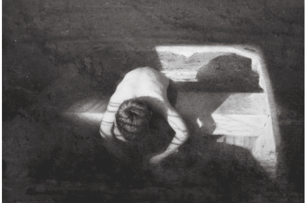
별이 총총한 밤하늘의 깊고 어두운 색은 풍부하고 짙은 검은색을 갈망하는 듯했습니다.
시들어가는 풀의 흰빛을 배경으로 거대한 실루엣의 그래픽적인 힘을 살리고 싶었고,
목탄이 그 역할을 해낼 수 있다는 것을 직감했습니다.
덩굴 목탄, 목탄 가루에 담근 종이 스텀프, 또는 작은 붓(보통 깨끗하게 씻은 유화 붓을 사용합니다.
특히 플랫 브러시가 가장 효과적입니다)을 사용하여 형태를 더욱 명확하게 하거나
중요한 어두운 부분을 강조하기 위한 가벼운 구조적 단서를 만듭니다.
압축 목탄처럼 진한 검은색은 후반 작업에 사용하려고 합니다.
바인 앤 윌로우 목탄은 벨벳처럼 부드러운 톤으로 덩어리를 이루는 데 탁월하며, 필요에 따라
쉽게 수정하거나 지울 수 있는 전반적인 구조선과 기준점을 빠르게 설정하는 데 적합합니다.
초기 블록킹이 어느 정도 완성되면 작업 방식을 완전히 바꾸기 시작합니다.
호흡과 속도가 느려지고, 육체적인 에너지 소모도 줄어듭니다. 정신적, 감정적 감수성이
더욱 중요해지고 모든 것이 더욱 신중해집니다. 물론 이러한 변화는 직관과 자신만의
작업 방식에 익숙해지는 것에 달려 있습니다. 그 경계는 미묘하고 점진적이며,
이젤 앞에서 오랜 시간과 경험을 통해 자연스럽게 드러나게 됩니다.

그림의 디자인 완성도를 점검하는 데에는 여러 가지 유용하고 실용적인 기법들이 있으며,
저는 드로잉 작업 전반에 걸쳐 이러한 기법들을 자주 활용합니다. 눈을 가늘게 뜨면
빛과 그림자의 기본적인 형태를 더 잘 볼 수 있어, 각각의 관계가 얼마나 정확한지 판단하는 데
도움이 됩니다. 때로는 거울에 비친 작품을 보면 구조적인 오류를 발견하거나,
이전에 미처 발견지 못했던 음영을 찾아내는 데 유용합니다. 또한, 작품을 방 건너편에서,
거꾸로, 또는 다른 조명 아래에서 보면 새로운 정보를 얻을 수 있습니다.
저는 항상 어떤 상황에서든 명암과 기본적인 형태가 어떻게 보일지 예민하게 관찰하려고 노력합니다.
작품을 더욱 발전시키기 위해, 빛이 가장 적은 부분부터 어두운 부분의 명암을 점차 진하게 표현하기
시작합니다. 이때 그림자는 불필요한 디테일 없이 단순하게 표현하려고 합니다.
특히 이 단계에서는 중간 톤과 빛에서 그림자로의 전환에 세심한 주의를 기울입니다.
이때 다양한 종류의 세무 가죽(더러운 것, 깨끗한 것, 낡은 것, 새것)과 크기가 다양한
종이 드로잉 스텀프가 유용하게 사용됩니다.
그리고 무엇보다 중요한 건, 열 손가락 모두를 사용하는 것입니다!
찰흙 지우개와 함께 이 모든 도구들은 질감을 조절하고 형태의 가장자리에 부드러움과 강약을
표현하는 데 놀라운 효과를 발휘합니다.
작업이 마무리될 무렵에는 가장 어두운 부분을 다시 평가하고 필요에 따라 새로운 어두운 부분을
덧칠합니다. 넓은 영역에는 압축 목탄을 사용하여 진한 검은색을 표현하고, 섬세한 부분에는
잘 깎은 목탄 연필을 사용합니다. 밝은 부분과 중간 톤의 전환을 다듬기 위해 제가 가진
모든 목탄 드로잉 도구를 조합하여 사용합니다. 종이 스텀프로 문지르거나, 붓이나 손가락으로
가볍게 블렌딩하거나, 샤무아로 살살 문질러 가장자리를 부드럽게 만듭니다.
"Stars Above"의 키 큰 풀밭처럼 마지막 하이라이트를 표현할 때는 주로 찰흙 지우개를 사용합니다.
그 풀밭은 먼저 넓고 균일한 명암을 표현한 다음, 찰흙 지우개로 조심스럽게 지워내는 방식으로
완성했습니다. 이 방법은 꽤 효과적이었고, 작은 붓, 종이 스텀프, 목탄 가루를 조합하여 풀밭의
어두운 부분을 강조할 수 있었습니다.
마무리에 가까워질수록 작업 속도는 훨씬 느려지고, 모든 붓질 하나하나를 신중하고
깊이 생각하며 합니다. 저는 보통 작품을 "새로운 시각"으로 바라보고 마무리에 필요한 부분이
무엇인지 다시 평가하기 위해 더 자주 휴식을 취합니다.

그림을 완성하는 것은 기술보다는 지혜에 더 가깝습니다. 그림은 작업할수록 서서히 초점을 맞춰가며,
그 그림만의 독특한 문제점과 해결책을 제시합니다. 단순히 이미지를 묘사하는 것을 넘어,
그림을 그린 작가의 경험, 감정, 의도, 생각, 동기를 기록한 것이 됩니다.
다소 난해하게 들릴 수도 있지만, 사실입니다. 단순하면서도 복잡한 면이 있습니다.
한편으로는 "자기 자신이 되는 것"과 "정직하게" 자신의 기술을 연마하는 것만으로 충분합니다.
하지만 "자기 자신이 되는 것"은 생각만큼 쉽지 않고, 정직하게 기술을 연마하는 것은
작업에 깊이 몰두할수록 점점 더 어렵고 복잡해집니다. 그래서 저는 "작품을 완성하는 것"을
몇 가지 예측 가능한 단계를 따르는 것으로 설명하는 경우가 드뭅니다.
모든 작품은 다르고, 모든 경험은 고유하기 때문에 작가의 반응은 빌려오거나, 형식적이거나,
부자연스러워서는 안 됩니다.
그림의 마지막 손길은 인간의 영혼과 정신의 지문과 같습니다. 예술 작품은 묘사하는 것만큼이나
많은 것을 드러낼 수 있으며, 작가의 손길이 드러나는 부분은 작품을 어떻게 받아들이는지에
지대한 영향을 미칩니다. 저는 작품이 새로운 생명력을 얻기 시작할 때, 더 크고 강렬하면서도
고요한 생명력이 모습을 드러내기 시작할 때 비로소 완성되었다고 느낍니다.
그때 비로소 저는 뭔가 의미 있는 것을 얻었다는 것을 알게 됩니다.

드로잉 재료
건식 재료에 관해서는 브랜드에 크게 구애받지 않습니다. 대부분의 도구는 매우 단순하고
기본적인 것들이라 좋은 브랜드들 간에 큰 차이가 없기 때문입니다.
그렇지만 창작 과정 동안 필요한 모든 재료를 손쉽게 사용할 수 있도록 준비해 두려고 합니다.
흑연 드로잉에는 다양한 경도의 연필, 샤프펜슬, 그리고 흑연 스틱(2H부터 8B까지 다양한 경도)이
필요합니다. 그림의 어두운 부분을 강조할 때는 석판화용 크레파스를 사용하기도 합니다.
흑연을 지울 때는 반죽형 지우개와 제도용 지우개를 사용합니다.
스머지 스틱(종이 뭉개기 도구)과 깨끗하거나 더러워진 세무 가죽을 사용하면 다양한 명암과
질감을 표현할 수 있습니다. 흑연 드로잉에는 주로 브리스톨 보드를 사용해 왔지만,
항상 흥미로운 질감의 다양한 종이를 사용해 보고 싶어 합니다.
목탄 작업을 할 때 저는 압축 흑색 목탄, 덩굴 목탄, 버드나무 목탄, 다양한 경도의
목탄 연필(주로 2B~8B), 세무 가죽(표면의 명암과 질감에 따라 깨끗한 것과 더러운 것을 사용),
반죽형 지우개(제도용/활자용 지우개 또는 목탄 전용 지우개), 그리고 다양한 크기의 종이 스텀프를
사용합니다. 가장자리를 부드럽게 하기 위해 가끔 낡은 붓도 사용합니다.
목탄 작업에 여러 종류의 종이를 사용해 봤습니다. 특정 브랜드나 종류의 종이에 얽매이지는 않고,
진한 검은색을 표현할 수 있을 만큼 적당한 질감이 있고,
거칠게 다뤄도 견딜 수 있을 만큼 튼튼한 종이면 충분합니다.
현재 제가 사용하고 만족하는 종이 몇 가지를 소개합니다: Stonehenge Paper Natural 90 lb.
– 저는 이 종이를 큰 사이즈로 구입해서 흑연과 목탄 모두에 사용합니다.
가끔 (즉, 드물게, 그리고 작은 작품에 한해서) 종이를 패널에 PVA 접착제로 붙인 다음,
종이 자체에 얇은 젯소(아크릴 프라이머) 층을 바릅니다. 그런 다음 220방 사포로 곱게 샌딩합니다.
이렇게 하면 커피, 차, 수채화 물감 등으로 얼룩을 칠하기에 적합한 표면이 만들어지고,
종이를 늘리거나 수성 물감을 사용할 때 종이가 울퉁불퉁해질까 걱정할 필요가 없습니다.
이렇게 만들어진 표면에 흑연으로 그림을 그립니다.
저는 목탄을 사용할 때 스톤헨지 90lb 용지를 즐겨 사용합니다. 이 용지는 풍부하고 진한 획을
표현하기에 적당한 질감을 가지고 있으면서도 섬세한 부분을 표현하기에도 충분히 곱습니다.
현재로서는 이 용지가 제게 잘 맞지만, 앞서 말했듯이 항상 새로운 것을 시도해 보고 싶어 합니다.
저는 재료에 대해 매우 실용적인 접근 방식을 가지고 있습니다. 품질이 괜찮고 제 앞에 있다면,
저는 무조건 사용합니다! 저는 어떤 결과가 나오는지 먼저 보고 나서 제 목적에 맞는지
스스로 판단하는 것을 좋아합니다. 아마 우리 모두 그렇게 할 것이고,
새로운 재료를 찾는 것은 예술가로서 겪는 기쁨이자 고통 중 하나일 것입니다.
There’s an almost mystical gravity to this old material. There’s no denying its seriousness once you’ve placed your first mark to paper. You find that you are, in essence, dealing with the extremes of creation, that most ancient and elemental contrast — dark against light.
As a child, I remember watching as my mother made rich black marks with charcoal on a broad sheet of white paper. She enjoyed drawing in charcoal and pastel, and I would watch quietly as she gently worked this velvety soot into the paper’s surface, and like magic, a world of textures and forms began to appear. This was one of my earliest memories, and to this day I am still enchanted by this medium and its capacity to communicate so powerfully. This is perhaps the reason I enjoy the tactile qualities of charcoal so much. I am no minimalist when it comes to drawing implements — I use everything but the kitchen sink, and it all ends up in the final piece in one way or another!
Drawing with charcoal provides that perfect mix of play and precision that I really love. I can move from broad and dynamic mark-making to the most quiet and delicate of passages, all in one piece.
How to Draw with Charcoal
Laying out the initial stages of a charcoal drawing is one of my absolute favorite things to do! A terrific amount of energy and expressive freedom are needed. Your intensity can hit a fever pitch as you push forward in total concentration, anxious and eager to capture what’s in front of you. However, none of this seemingly chaotic activity is truly arbitrary or “wild.” It is, in fact, passionate thinking in action. Often, you’re not after “perfect” objective realism, but a still point between what you see and all that you feel towards a given experience.
To me what matters most in these early stages is to capture — with strength, energy, and boldness — the most vital elements of the whole concept and design. I’m trying to distill these elements to their pictorial essence; not just as a practical foundation for the technical drawing, but also the moment when the expressive heart of the piece is established. I cannot overstate the importance of this element. Too often, pictures are rushed along to incidental and infinitesimal details without being properly settled on a strong foundation.
I begin much the same as I would a painting: blocking in the major shapes of light and dark in the composition, being careful to preserve the vivacity and strength of important gestures. Whether the drawing is large or small, this principle remains the same.
Lately, I’ve been using charcoal powder and a broad brush to establish the larger areas of a drawing more loosely. This can be tricky, but blocking in values with this technique is fun, very painterly — and very messy! The brush allows me to keep my edges soft and to create mid-tones and transitions in value, which feel lively and natural. At this stage, I’m careful to preserve the white of the paper for my lightest lights. I don’t typically build my lights with white chalk, pastel, conté, or other media. So it’s paramount early on to anticipate the overall design and then judiciously work around the light masses.
Working into darker passages with an eraser can produce some striking effects. Lifting out the lights in this manner can be achieved by means of erasing in order to reveal the white of the paper. I’ll do this mostly with clean kneaded erasers (and the occasional use of charcoal erasers and drafting-type erasers), mostly to further define the lights I’ve already established. To some extent, you’re literally pulling light out of darkness, being sensitive to the direction the light moves across the form.
This way of working is more akin to oil painting than it is to traditional drawing methods — the emphasis is more on form, light, and atmosphere than it is on line, shape, and the calligraphy of mark-making.
The medium itself has an inherent character and charisma, which I try not to fight. In fact, the working qualities particular to each medium have everything to do with how, and when, I choose to use them. If I’m sensitive enough, I can find which medium best captures the essential qualities of what I’m trying to express in a piece. I think this can be seen in “Stars Above,” where the deep dark of the starry sky simply begged for sumptuous and sooty blacks. I wanted to preserve the graphic power of that tremendous silhouette against the white of the dying grass, and knew instantly that charcoal could deliver.
I’ll give myself light structural indicators to further define forms and/or to accent crucial darks with vine charcoal, paper stumps dipped in charcoal powder, or small brushes (usually discarded oil painting brushes that have been cleaned…flats seem to work best). I try to hold off using the heavier darks of compressed charcoal for later in the process. Vine and Willow charcoal are great at massing in solid velvety tones, and well suited for quickly establishing general structural lines and reference points that are easy to adjust or erase if necessary.
Once the initial block-in is reading strongly, I’ll begin to transition everything about the way I’m working. My breathing slows, and my pace slows as well. Less physical energy is required. Mental and emotional sensitivity become dominant. Everything becomes more deliberate. This transition is, of course, a matter of intuition and becoming familiar with your own way of working. The demarcation is often subtle and gradual—recognizing it comes with time and experience in front of the easel.
There are many good and practical techniques for checking the strength of the picture’s design, and I use them often throughout the creation of a drawing. Squinting helps me to see the basic shapes of light and dark to assess the accuracy of their relation to one another. Sometimes, viewing the work in a mirror is helpful in spotting structural errors as well as revealing negative shapes that I might not have seen before. Also, looking at the piece from across the room, upside down or in different light can give new information to me. I am always trying to be sensitive to how the values and basic shapes might look in any circumstance.
To further the piece, I carefully begin pushing the value of my deeper darks in the areas with the least amount of light, making sure to keep my shadow masses simple without extraneous detail. I try to be especially careful with the mid-tones at this stage and the transitions from light to shadow. Here a variety of chamois (dirty, clean, old, and new) come in handy, along with a good selection of paper drawing stumps in various sizes; and most importantly, all ten fingers! Along with kneaded erasers, these all work marvelously for manipulating textures and creating hard and soft transitions on the edges of form.
As I near the end of my process, I’ll reassess my darkest darks and freshly state new darks where necessary. For broader passages I’ll use compressed charcoal to achieve very rich blacks, and well-sharpened charcoal pencils for some of the finer work. A combination of every charcoal drawing implement I own goes into refining the light masses and the mid-tone transitions. I’ll diffuse edges by smudging with paper stumps, lightly blending with brushes or fingers, and/or gentle licks of a chamois. I work mostly with a kneaded eraser to pull out those final highlights, as in the tall grasses in “Stars Above.” There the grass was accomplished by first establishing a broad even tone of value, then carefully erasing into it using a kneaded eraser. This worked quite effectively and allowed me to accent some of the darks in the grass with a combination of small brushes, paper stumps, and charcoal powder.
As I approach the finish, the work moves along much more slowly, and each mark is made carefully and contemplatively. I’ll usually take breaks more often in order to get “fresh eyes” on the piece and reassess what remains as necessary to the finish.
Finishing a drawing is more about wisdom than it is about technique. A drawing will slowly come into focus the more it is worked on and present its own very unique combination of problems and potential solutions. It becomes more than merely a portrayal of an image; it is also a record of the experiences, feelings, intentions, thoughts, and motivations of the artist who created it. This may sound arcane, and in a way it is. It is at once simple and complex. On the one hand you have only to “be yourself ” and practice your craft “honestly.”
Then you find that “being yourself ” is not as easy as it sounds, and that practicing your craft honestly becomes increasingly difficult and complex the deeper you delve into the craft. This is why I rarely speak of “finishing a piece” in terms of following a few predictable steps. Every piece is different, every experience unique, and so the artist’s response should not be borrowed, perfunctory, or unnatural.
Those final touches on a drawing represent a kind of fingerprint of the human soul and psyche. A work of art can reveal as much as it portrays, and what it reveals about the artist’s hand is immensely important to the way the picture is received. I’ll know a work is finished when it begins to hum with a new life; that other larger, stronger, and quieter life begins to emerge, and then I know I’ve got something.
Drawing Materials
When it comes to dry media, I’m not particular about brands. Many of these tools are so simple and elemental that there is little difference between most of the better brands. That being said, I try to have all of these out and within reach during the creative process.
Working in graphite requires graphite pencils in varying degrees of hardness, a mechanical pencil, and graphite sticks (in densities varying from 2H to 8B). I’ll occasionally heighten darks in a drawing with a lithographic crayon. To erase graphite, I’ll use kneaded erasers and some drafting-type erasers. Different values and textures are also attainable with paper stumps (smudge sticks) and clean and/or dirty chamois. The paper I use for graphite drawings has traditionally been Bristol board; however, I’m always looking to try different things with interesting surfaces.
For working in charcoal I use compressed black charcoal, vine and willow charcoal, charcoal pencils in varying densities (mostly 2B-8B), chamois (some clean, some filthy black, depending on the value and texture I’m looking to make), kneaded erasers (sometimes drafting/type erasers and/or special charcoal erasers), and paper stumps of varying sizes. I’ll occasionally also use old paint brushes for some softening of edges. I have used many different types of paper for charcoal. I’m not beholden to a particular brand or type of paper here, as long as it has enough tooth to give me rich blacks, and is tough enough to withstand some rough treatment.
Here are some I’m working with now and enjoying: Stonehenge Paper Natural 90 lb. – I buy these in larger sizes and use for both graphite and charcoal. On occasion (i.e., rarely and on smaller works) I’ll mount the paper to panel using PVA glue in order to apply thin layers of gesso (acrylic primer) to the paper itself. I’ll sand that to a fine finish (220 grit sandpaper). Then I have a surface that will receive stains (either with coffee, tea, watercolor or other), and I don’t have to fuss with stretching the paper or be concerned that the paper might buckle from the application of water-based treatments. I’ll use graphite to draw on the resulting surface.
I also enjoy using the Stonehenge 90 lb paper with charcoal. It has enough tooth to properly receive a rich heavy application, and it’s fine enough for the more delicate passages. It suits me fine for now; but as I said, I’m always on the lookout to try something new.
I have a very workmanlike approach to materials. If they are of decent quality and I have it in front of me, I’ll use it! I like to see what happens and then decide for myself whether it suits my purposes. I suppose we all do that, and the search for new materials is one of the joys—and agonies—of being an artist.
'그림공부' 카테고리의 다른 글
| ( 그림 공부 ) 풍경화 시연: 큰 형태, 대담한 붓놀림(Landscape Painting Demo: Big Shapes, Bold Brushstrokes) (1) | 2026.01.20 |
|---|---|
| ( 그림공부) 분위기 있는 그림을 그리러면 (Exploring Mood in Painting) (6) | 2026.01.10 |
| ( 그림공부 ) 의도적인 붓질: 나의 회화 여정-Deliberate Strokes: My Path Into Painting (0) | 2025.12.16 |
| ( 그림공부 ) 느슨하게 그리는 방법- How to Paint Loose (2) | 2025.12.04 |
| ( 그림공부 ) 모네가 강을 옮길 때 (When Monet moved a River) (7) | 2025.11.28 |


