요즘 부쩍 느낌이 있는 그림에 대한 생각이 많은데
Inside Art 에 흥미있는 기사가 있어 옮긴다.
( 번역은 구글 번역, 영어 원은 맨 뒤에 )
-------------------------------------------------------------------------
회화는 느낌, 감정 불러일으킴, 그리고 (넓은 의미에서) '이야기'에 관한 것입니다.
우리 마음에 오래도록 남는 그림들은 종종 삶의 신비를 건드리며,
우리를 마음과 상상, 감정의 세계로 이끌어 줍니다.
그렇다면 어떻게 그런 그림을 그릴 수 있을까요?
첫 번째 조건은 '제대로' 그려야 한다는 생각을 버리는 것입니다.
기본적인 드로잉 기술은 물론 필수적이지만, 감정, 즉 '분위기'는 무엇을 그리느냐가
아니라 어떻게 그리느냐에 달려 있습니다. 그림 속 분위기는 대개 색채, 명암,
가장자리 처리 방식, 즉 그림의 '비서술적' 측면들에 의해 결정됩니다.
이는 감정을 불러일으키는 시와 묘사하는 산문의 차이와 비슷합니다.
분위기와 감정을 표현하는 것이 목표라면, '정확함'이나 '믿을 만함'을 추구하는 전략에서
벗어나 심리적이고 표현적인 접근 방식을 취해야 합니다.
주된 목표는 정확한 구도나 원근법(중요할 수도 있고 아닐 수도 있지만)이 아니라,
보는 이에게 감정적 경험, 공감, 그리고 연결을 불러일으키는 순간을 만들어내는 것입니다.
색채의 역할
색채는 분위기를 전달하는 가장 강력한 도구 중 하나입니다.
물론 각 색조는 고유한 심리적, 감정적 연상을 불러일으키지만, 색온도(따뜻한 색과 차가운 색)와
채도(또는 강도)를 함께 고려하면 더욱 효과적입니다.
희석되지 않은(채도가 높은) 빨강, 분홍, 노랑, 주황, 채도가 높은 청록색과 녹색과 같은
따뜻하고 강렬한 색은 높은 에너지를 자극하는 색으로 여겨집니다.
반면 차갑고 차분한 진홍색, 파랑, 나폴리 옐로우, 황토색, 흙색, 보라, 회색 등 채도가 낮고
차분한 색은 평온함, 고요함, 사색, 우울함과 같은 감정을 표현하는 데 자주 사용됩니다.

*(채도(Chroma)는 색의 "순도" 또는 희석되지 않은 정도를 나타냅니다.
사진 편집 소프트웨어의 "강도"와 같은 개념입니다. 튜브에서 바로 짜낸 카드뮴 옐로우는
명백히 채도가 높은 색입니다. 여기에 보라색이나 번트 엄버, 옐로 오커 등을 약간 섞으면
색이 회색빛을 띠게 되어 순수함과 강렬함이 줄어들거나, 흔히 말하는 "채도 감소" 현상이 나타납니다.)
명도 측면에서 보면, 비슷한 명도의 영역들은 균형감과 부드러움, 그리고 종종 "고요한"
느낌을 전달하는 반면, 명암 대비가 강한 영역들은 강렬함과 "시끄러운" 리듬감,
그리고 진동감을 전달합니다. 하지만 무엇보다 중요한 것은 화가가 이러한 색과 명도를
어떻게 조합하고 병치(나란히 배치)하는지에 따라 그림의 분위기가 결정된다는 점입니다.
피카소의 청색 시대 작품 중 하나인 1903년 작 "삶"(위 그림)을 예로 들어 보겠습니다.
이 초기 작품은 피카소가 1901년부터 1904년까지 겪었던 감정적 혼란과 경제적 궁핍에서
영감을 받았습니다. (시골에서 파리로 막 도착했을 당시, 돈 한 푼 없었던 피카소는
고향의 절친한 시인 친구와 작은 아파트에서 함께 살았는데, 그 친구가 자살하는 비극을 맞았습니다.)
피카소의 우울한 감정은 이 시기 그의 작품 세계에 그 어느 예술가도 이전에는 시도하지
않았던 방식으로 깊이 스며들어 있습니다.
하지만 그의 작품 속 이미지는 개인적인 고통을 넘어 보편적인 주제를 담고 있습니다.
차가운 색조와 절제된 명암은 신비로운 인물들과 어우러져 인간 삶의 순환을 애도하는 듯한
시적인 이미지를 만들어냅니다. 푸른색은 모두 채도가 낮아 회색에 가까운 색조입니다.
필요한 부분에는 명암 대비가 뚜렷하게 나타나며, 정확한 색채 표현 또한 돋보입니다.
하지만 이러한 요소들은 마치 초점이 맞춰졌다 흐려졌다를 반복하며,
주된 역할이 아닌 보조적인 역할을 하는 듯합니다.
다양한 이미지가 혼합되어 단순한 서사를 무너뜨리고, 일상생활에서 흔히 볼 수 있는 색채에서
벗어난 대비는 장면을 평범한 현실에서 벗어나 상징과 신화의 영역으로 옮겨놓습니다.
어둡고 음울하지만 동시에 예지력이 있고 함축적인 분위기를 자아냅니다.

구도, 배치, 그리고 분위기
색채 외에도 그림 속 요소들의 구도와 배치는 분위기를 형성하고 의미를 전달하는 데
중요한 역할을 합니다. 사물의 배치, 원근법의 사용, 그리고 전체적인 구성은 관람자가
그림을 인식하고 경험하는 방식에 영향을 미칩니다.
우리가 살펴본 위의 피카소 그림에서, 얕고 불분명한 공간과 밀접하게 모여 있는
(하지만 모호하게 연결된) 인물들의 흩어진 몸짓은 역사 속에서, 혹은 시간의 흐름에서
완전히 벗어난 듯한 음울하고 오래된 드라마나 이야기를 암시합니다.
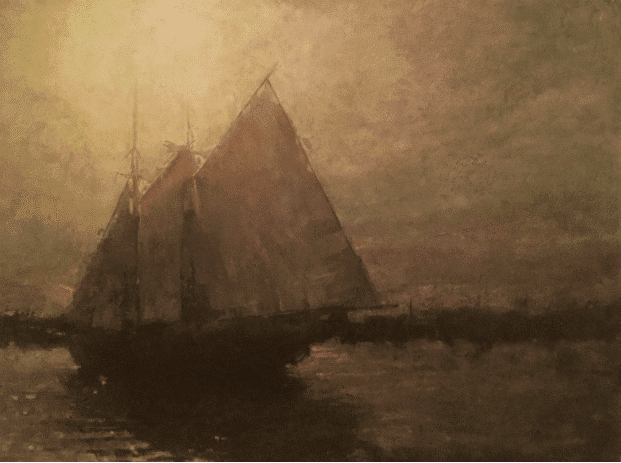
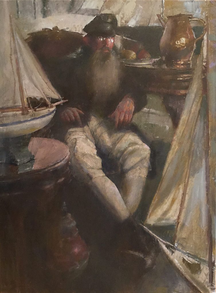
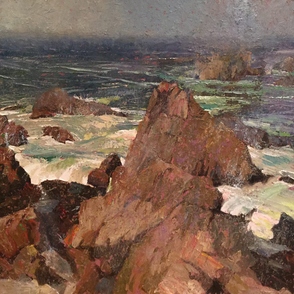
위의 정물화에서 C.W. 먼디는 구도를 통해 다양한 "이야기", 즉 잠재적인 의미를 제시합니다.
전통적인 정물 소재인 놋쇠 주전자와 구리 물병은 어두운 구석에 모여 있는 반면,
비전통적인 소재는 말 그대로 시선을 사로잡습니다.
여기에는 재치 있는 이중적 의미가 담겨 있습니다. 한편으로는 장난감처럼 보이지만,
다른 한편으로는 잃어버린 젊음을 암시하는 골동품이기도 합니다.
자동차와 주인공(서류 가방과 코트를 입은 전형적인 사업가) 사이의 거리는,
관람자를 대변하는 인물을 고립시켜, 주변 사물과 접촉하지도 않고, 어떤 것에도 반영되지 않은 채
서 있게 만듭니다.
전체적으로 따뜻한 빛이 이러한 고립감을 누그러뜨리고 과거에 대한 향수를 불러일으킵니다.
분위기는 확산 또는 의도적인 모호함(본질적으로는 작품에서 밑그림을 그리거나
덧칠하는 방식)의 정도와 관련이 있습니다. 부드럽게 처리된(블렌딩된) 가장자리,
흔히 "흐릿한" 가장자리라고 불리는 부분은 그림의 특정 영역을 덜 명확하게 만들어
관람자가 작품의 감정적 내용을 이해하기 위해 기법을 활용하여 이미지를 완성하는 데
적극적으로 참여하도록 유도합니다. 강렬한 분위기를 자아내는 그림은 날카로운 가장자리와
시선을 사로잡는 대비를 최소화하거나 제거합니다. 이는 기억이나 꿈의 분위기를 불러일으킬 수 있습니다.
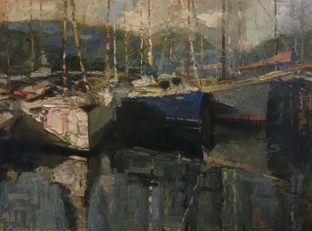
회화에서의 분위기는 색채, 구도, 기법, 스타일의 복합적인 상호작용입니다.
작가가 인간 감정의 깊이를 전달하고자 했을 때, 관람자는 그림을 통해 감정적인 여정을 경험하게 됩니다.

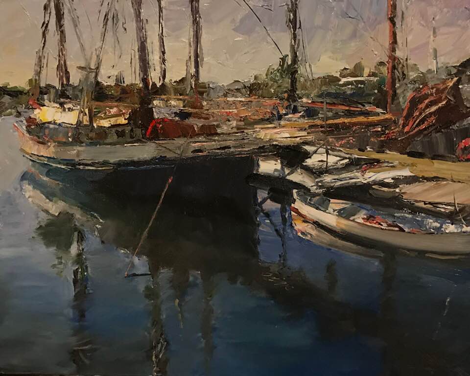
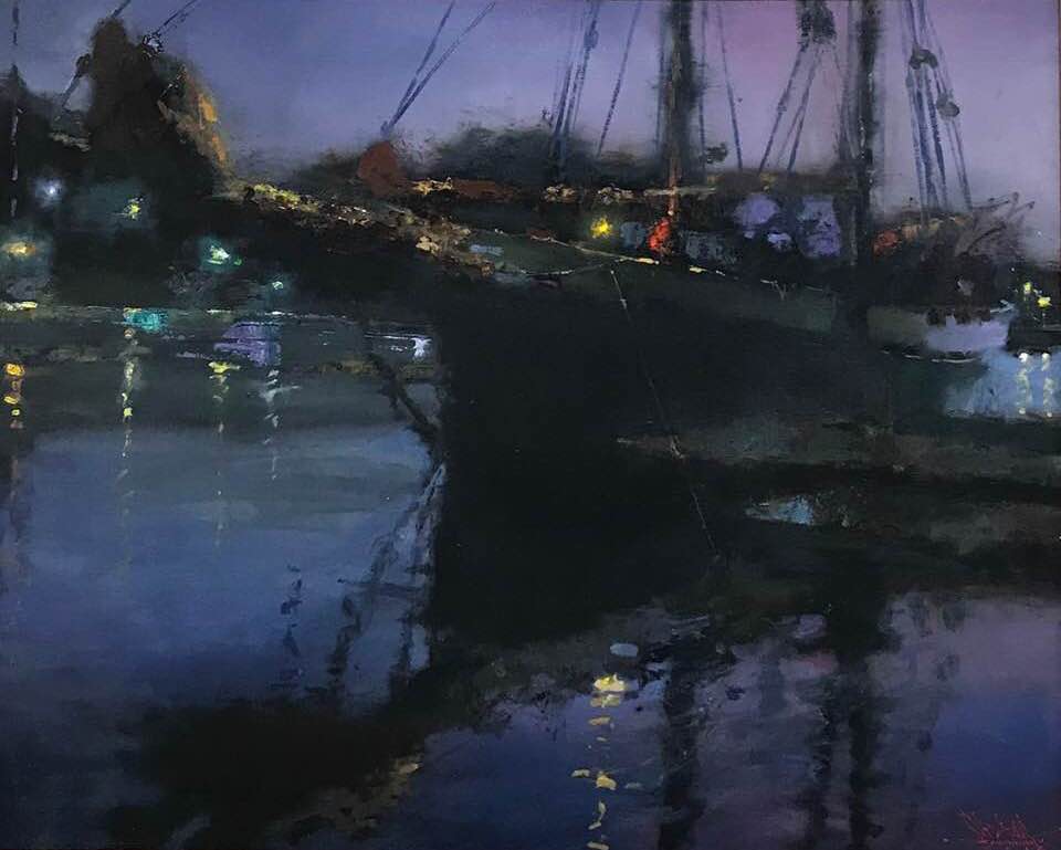
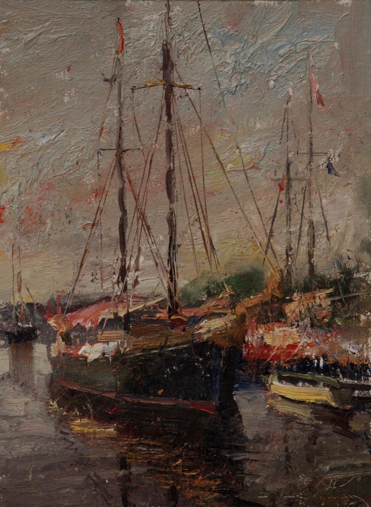
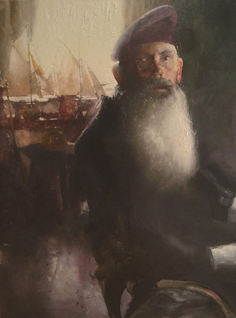
Charles Warren Mundy 의 다른 작품들..


Painting is about feeling, evocation, and “stories” (in the widest sense). The paintings that stay with us often touch upon the mysteries of life, transporting us into realms of mind, imagination, and emotion. But how is it done?
The first requirement is letting go of needing to get it “right.” Basic drawing skills are a pre-req, sure, but feeling, or “mood,” arises not from what you paint but how you paint it. And mood in painting usually comes down to how you handle color, values, and edges – all the “non-descriptive” aspects of painting, really.
It’s a bit like the difference between poetry that evokes and prose that describes. If the goal is atmosphere and mood, the strategy changes from being “correct” or “believable” to something closer to psychological and expressive. The primary goal becomes not correct composition or perspective (which may or may well not be important) – but rather whatever triggers that elusive moment of emotional experience, recognition, and connection with the viewer.
The Role of Color
Color is one of the most potent tools for conveying mood. Yes, each hue carries its own psychological and emotional associations, but you’ll get more milage by thinking in terms of temperature (warm and cool) and chroma (or intensity).
Warm and intense colors, like undiluted (high-chroma) reds, pinks, yellows, oranges, saturated aquas and greens are thought of as high-energy triggers. The cooler, more subdued crimsons, blues, Naples yellow, ochres, raw earths, violets, and grays – or any subdued, less intense/chromatic colors, really – are frequently used to suggest feelings of calmness, serenity, thoughtfulness, and melancholy.
*(Chroma means how “pure” or rather undiluted a color is. It’s like “intensity” in photo editing software. Cadmium yellow out of the tube is an obviously high-chroma color – dilute it by adding a little purple or some burnt umber or yellow ochre and you will gray it somewhat, make it less pure and intense, or as some say, “knock back” the chroma.)
In terms of value, similarly matched values convey balance and, often, a sense of soft or “quiet” calm, whereas high-contrast areas of dark and light again convey intensity, a sense of “loud” rhythm and vibration. Crucially though, it’s largely how the artist combines and juxtaposes (places side by side) these colors and values that conveys a painting’s mood.
Consider one of Picasso’s blue period paintings, his “Life” from 1903 (above). This early work was inspired by Picasso’s own emotional turmoil and financial destitution during the period (1901-1904). (Newly arrived in Paris from the country with little to no money, Picasso and his best friend from back home were sharing a tiny apartment when the friend, a poet, committed suicide.)
Picasso’s melancholy mood literally colors this period of his work in a way no other artist had ever done before. And yet the imagery moves beyond his personal problems and leans into the universal.
The close and uniformly cool hues and subdued values align with the mysterious figures to create a mournful poetic vision of the cycles of human life. These blues are all low-chroma, edging toward grays. There’s contrast where there needs to be, and accuracy too, but these go in and out of focus, as it were, and play supporting, not primary roles.
The mixed imagery defeats a simple narrative, and the transposition away from the expected colors of daily life removes the scene from ordinary reality and places it in the realm of symbolism and mythology. It’s dark and brooding but also far-seeing and suggestive.
Composition, Arrangement, and Atmosphere
Beyond color, the composition and arrangement of elements within a painting shape mood and convey meaning as well. The placement of objects, the use of perspective, and the overall layout influence how viewers perceive and experience any painting. In the Picasso above that we’ve been studying, the shallow, undefined space and divergent gestures of the closely grouped (yet ambiguously related) figures suggest a somber, ancient drama or story lost to history if not entirely outside time.
In the still life above, C.W. Mundy uses composition to suggest a variety of “stories,” otherwise known as potential meanings. Traditional subjects of still life – brass kettle and copper pitchers – are crowded into a shadowy corner while less conventional subject matter literally takes the spotlight. Here a playful double-meaning comes in – on the one hand, these are toys, on the other they’re antiques, suggestive of lost youth.
The distance between the car and the lead figure – a stereotypical businessman with a briefcase and an overcoat – leaves the man, a stand-in for the viewer, isolated – neither touching nor reflected by anything else in the arrangement. The overall warm light softens the blow and wraps the whole in nostalgia for the past.
Atmosphere relates to the amount of diffusion or deliberate indefiniteness (essentially, either under-drawing or over-blending in the work). Softened (blended) often called “lost” edges leave areas of a painting less defined and therefore require the viewer to become actively involved in completing the image, using technique to convey the work’s emotional content. Strongly atmospheric paintings minimize or eliminate hard edges and attention-getting contrasts. This can evoke an aura of memories or dreams.
Mood in painting is a complex interplay of color, composition, technique, and style. A viewer experiences a painting as an emotional journey when the artist has aspired to convey something of the depths of human feeling.
'그림공부' 카테고리의 다른 글
| ( 그림공부 ) 눈(snow)을 잘 그리는 방법 (3) | 2026.01.22 |
|---|---|
| ( 그림 공부 ) 풍경화 시연: 큰 형태, 대담한 붓놀림(Landscape Painting Demo: Big Shapes, Bold Brushstrokes) (1) | 2026.01.20 |
| ( 그림공부 )목탄으로 그림 그리는 방법- How to Draw with Charcoal (0) | 2025.12.18 |
| ( 그림공부 ) 의도적인 붓질: 나의 회화 여정-Deliberate Strokes: My Path Into Painting (0) | 2025.12.16 |
| ( 그림공부 ) 느슨하게 그리는 방법- How to Paint Loose (2) | 2025.12.04 |


