Plein Air Magazine 에 서양화가 Kyle Buckland가 그림 그리는 과정에
대한 글이 있어 옮긴다.
이 화가는 유투브에도 동영상이 많아 자주 찾아 보는데 과감한 붓터치가
아주 인상적인 화가이다.
그가 강조하는 "크게 그리고 과감한 붓터치 ( Big Shapes and Bold brushstroke) 시범을
보이고 있다.
이번 기회에 다시 한번 BLAST를 마음에 새기면서...
(Big brush, Large space, Accent later, Soft edge, Take time)
(번역은 구글, 영어 원문은 맨뒤에 )
------------------------------------------------------------------------------------------------
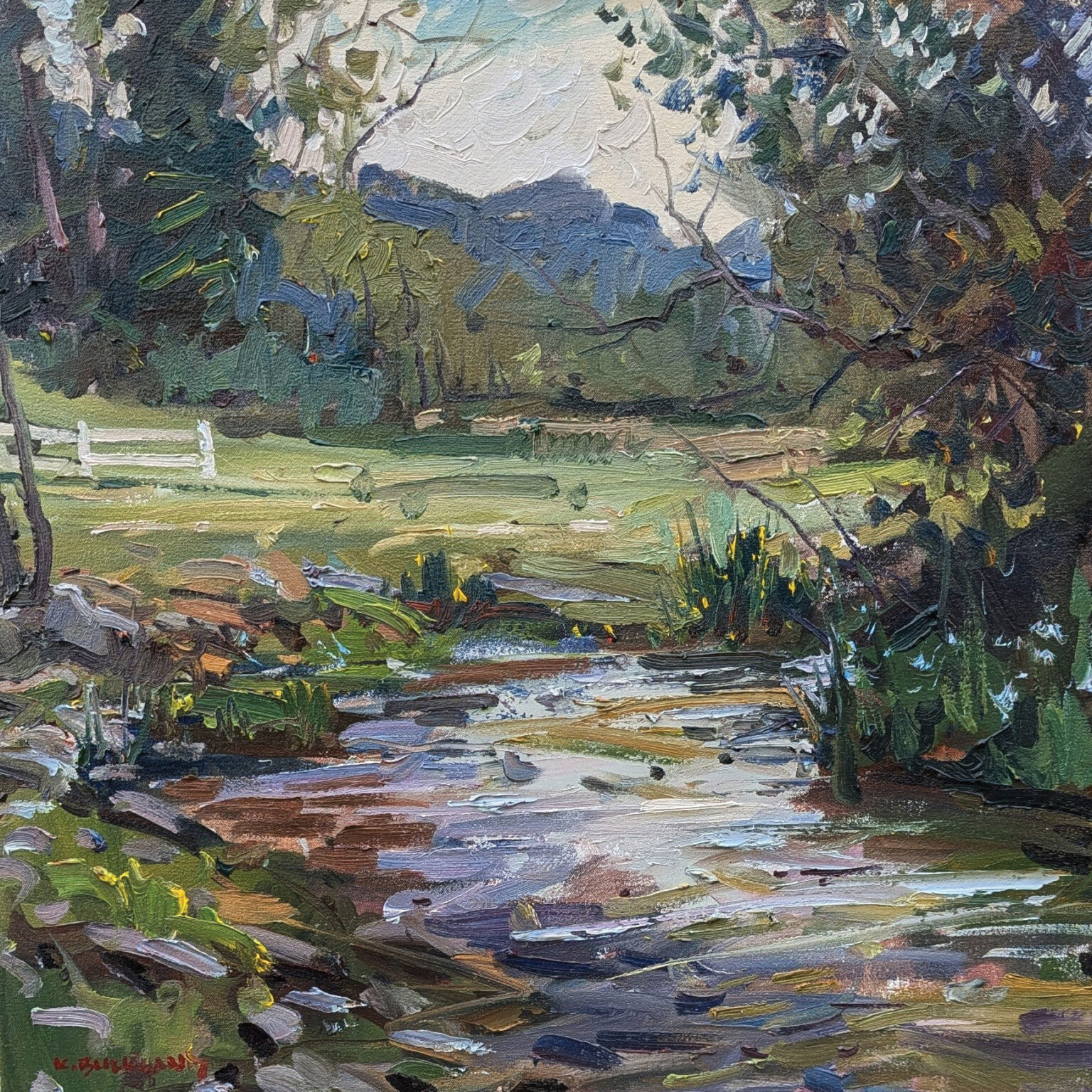
이 단계별 풍경화 시연에서 카일 버클랜드는 "개울가의 5월"이라는 작품이 처음의 활기찬
붓질부터 보는 이의 시선을 사로잡는 마지막 마무리까지 어떻게 발전해 나가는지 보여줍니다.
그는 초반의 세부 묘사에 매몰되지 않고, 큰 형태, 명확한 명암 관계, 그리고 의도적인 붓질을
통해 구도를 구축해 나갑니다. 버클랜드는 또한 움직임, 초점, 그리고 시각적 흐름에 대한
자신의 생각을 공유하며, 각 단계가 완성된 그림을 통해 보는 이의 시선을 어떻게
이끌어가는지 설명합니다. 즐겁게 감상하세요!
STEP 1

"흰 캔버스에 바로 빠르게 스케치를 했어요. 번트 시엔나와 울트라마린 블루 딥을
섞어서 주요 형태를 스케치했죠."라고 버클랜드는 말합니다.
"세부적인 묘사는 제쳐두고, 전체적인 큰 형태에 집중하려고 노력했어요.
저는 이런 초기 단계에 매료되는 편이에요. 완성작이 될 때까지
그 초기 단계의 생동감을 유지하는 것이 제 목표입니다."
STEP 2

“여기서는 얇은 스테인을 덧입혀 큰 형태를 잡고 명암의 관계에 집중했습니다.
나무는 어둡고 들판은 나무보다 조금 밝지만 하늘과 물만큼 밝지는 않다는 것을
표현했습니다. 또한, 스케치를 시작하면서 왼쪽 개울둑을 따라 이어지는 각도를
놓치지 않으려고 어두운 색으로 포인트를 주었습니다.”
STEP 3

“이 단계에서 저는 본격적으로 색을 겹겹이 칠하기 시작했습니다.
형태는 여전히 최대한 크게 유지했지만, 초록 잔디를 세 부분으로 나누었습니다.
멀리 있는 부분은 밝은 녹색, 중간에는 중간 톤의 녹색, 그리고 가까이 있는 부분은
어두운 녹색으로 했습니다. 이젤에서 조금 떨어져 서서 붓을 연필처럼 쥐기보다는
칼처럼 휘둘렀더니 더 역동적인 붓놀림이 가능해졌습니다.”
STEP 4
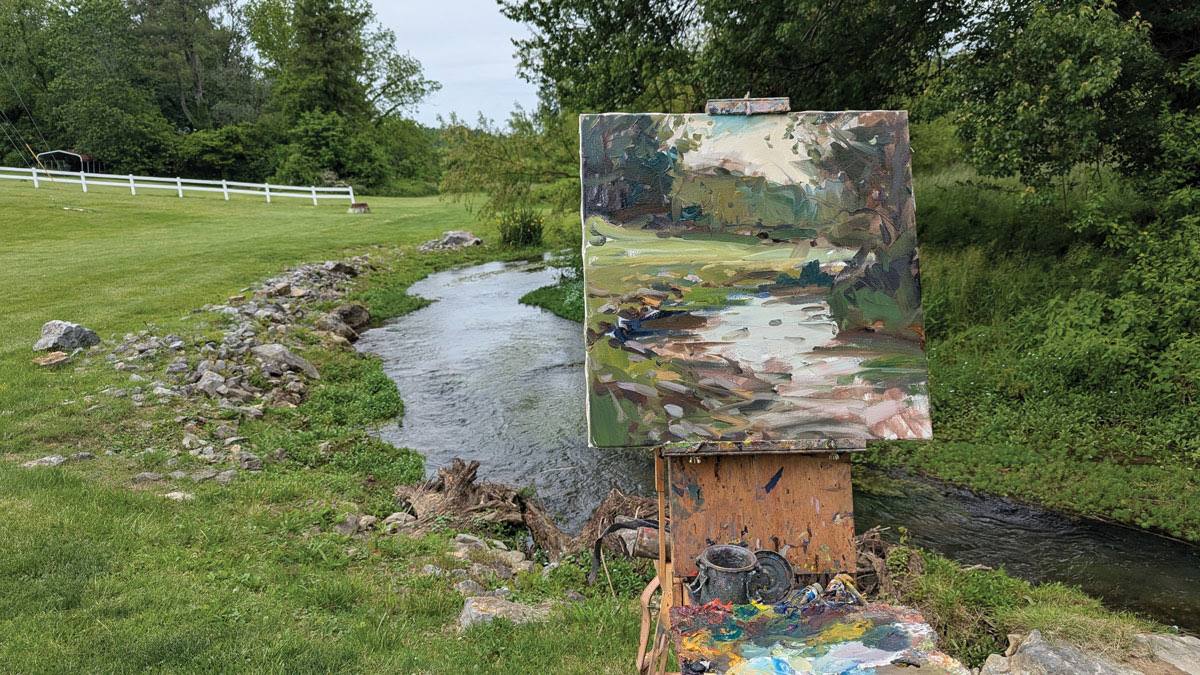
"이제는 작은 부분들에 집중하면서, 전경의 바위들을 부각시키고 물에 비친 반영을
더했습니다. 여전히 크고 중간 크기의 붓을 사용했고요.
그리고 어떻게 하면 보는 사람이 그림 전체를 따라 걸어갈 수 있도록 유도할 수 있을지
고민했습니다. 그림의 한 부분에서 다른 부분으로 이어지는 다리를 만들고 싶었어요."
STEP 5

“각 영역에 얼마나 세밀한 묘사를 넣을지 결정하기 시작했고,
제가 ‘작은 보석 같은 부분’이라고 부르는 곳에 집중했습니다.
꽃과 울타리를 추가하고 바위의 윤곽을 좀 더 명확하게 표현했죠.
그러면서도 보는 이의 시선을 그림 전체로 이끄는 지그재그 움직임을 계속해서
다듬었습니다. 이 그림의 가장 매력적인 부분은 수평으로 뻗은 나뭇가지 바로 아래에
있는 작고 노란 꽃들이지만, 저는 보는 이가 거기에만 머물지 않기를 바랐습니다.”
FINAL STEP
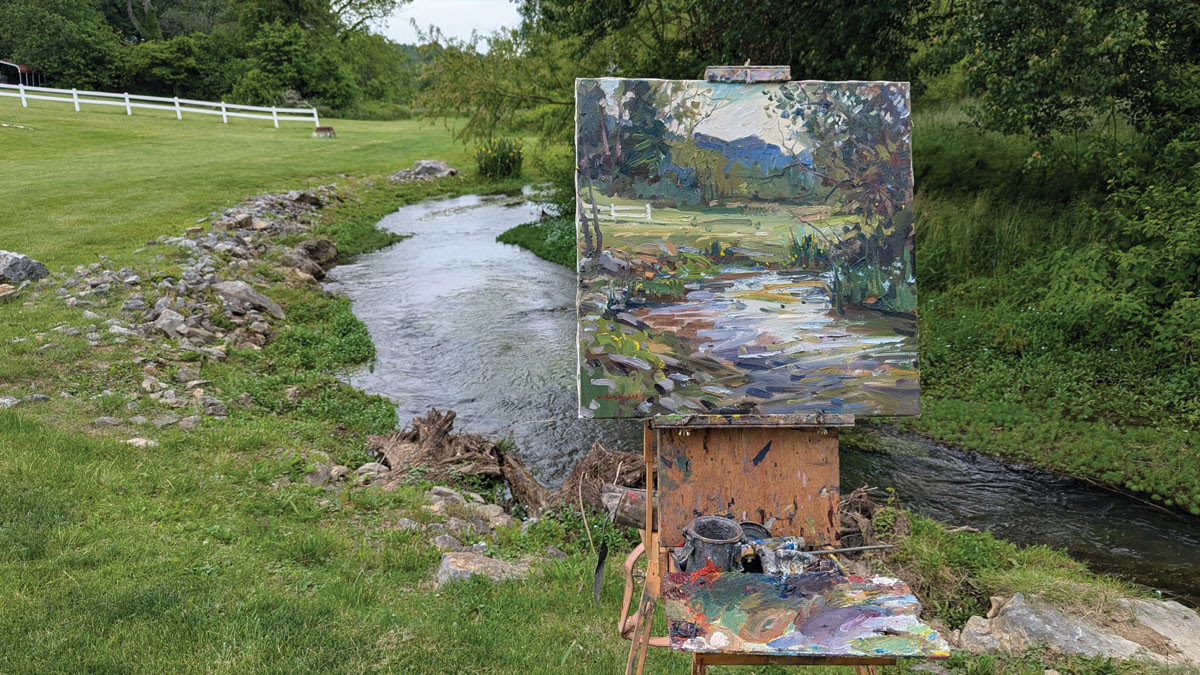
"이 시점에서 저는 거슬리는 부분을 찾아 수정 작업을 했습니다.
예를 들어 왼쪽에 추가한 작은 나무가 그렇죠. 마치 과속방지턱처럼 보는 사람의 시선이
그림 왼쪽으로 쏠리지 않도록 잡아주는 역할을 합니다.
저는 보는 사람이 천천히 그림을 감상하며 최대한 오랫동안 그림을 음미할 수 있도록 하고 싶었습니다."

-------------------------------------------------------------------------------
In this step-by-step landscape painting demo, Kyle Buckland walks us through the evolution of “May Along the Creek” — from its first energetic marks to the final refinements that hold the viewer’s eye. Rather than getting lost in early detail, he builds the composition by establishing big shapes, clear value relationships, and purposeful brushwork. Along the way, Buckland shares how he thinks about movement, focus, and visual pacing, revealing how each stage plays a role in guiding the viewer through the finished painting. Enjoy!
“I did a quick drawing right onto the white canvas, sketching in the main shapes with a mixture of burnt sienna and ultramarine blue deep,” says Buckland. “I tried to look past all the detail and see the big, underlying shapes. I’m a sucker for these early stages — it’s a constant goal of mine to preserve their energy all the way through to the finished painting.”
“Here, I laid in big shapes with a thin stain, focusing on the relationship of values. I established that the trees are dark, and the field is a little lighter than the trees, but not as light as the sky and the water. Also, I started to do some drawing, and I wanted to make sure I didn’t lose that angle along the bank of the creek on the left so I hit it with a nice dark accent.”
“At this stage, I really started to layer up the color. I still kept the shapes as big as possible, but I broke up the green grass into three distinct areas — lighter green in the distance, a medium value in the middle, and a darker green in the foreground. I stood back from the easel and held the paintbrush more like a sword than a pencil, which gave me more active brushstrokes.”
“Paying attention to smaller areas now, I brought the rocks into focus in the foreground and added reflections in the water, still sticking with big to medium-size brushes. And I considered how I could guide the viewer on a walk around the composition. I wanted to create a bridge from one part of the painting to another.
“I started to decide how much detail I wanted in different areas and began to focus on what I call the little jewel areas. I added flowers and the fence, and I defined the rocks a bit more. All the while, I continued to work on the zigzag motion that pulls the eye through the composition. The sweet spot of this painting is the tiny yellow flowers right below the horizontal tree branch, but I didn’t want the viewer to get stuck there.”
“At this point I looked for things that bothered me and worked to fix them. One example is the little tree I added on the left. It acts like a speed bump to keep the viewer’s eye from flying off the left side of the painting. I wanted to slow the viewer down and let them experience the painting for as long as possible.”
'그림공부' 카테고리의 다른 글
| ( 그림공부 ) 현장에서 비행기 그리기 (Painting Airplanes on Location) (3) | 2026.01.23 |
|---|---|
| ( 그림공부 ) 눈(snow)을 잘 그리는 방법 (3) | 2026.01.22 |
| ( 그림공부) 분위기 있는 그림을 그리러면 (Exploring Mood in Painting) (6) | 2026.01.10 |
| ( 그림공부 )목탄으로 그림 그리는 방법- How to Draw with Charcoal (0) | 2025.12.18 |
| ( 그림공부 ) 의도적인 붓질: 나의 회화 여정-Deliberate Strokes: My Path Into Painting (0) | 2025.12.16 |


