겨울의 하얀색: 눈의 "온도"를 표현하는 색채

《겨울의 하얀 눈》(패널에 유화, 16×20인치)에서는 햇빛이 비치는 부분 안에서조차
미묘한 색온도 변화가 극적인 반짝임을 만들어냅니다.
눈의 그림자 부분을 햇빛이 비치는 부분보다 아주 약간만 어둡게 하고 색온도의 대비에
더 집중함으로써 전체적으로 매우 밝고 생기 넘치는 효과를 냅니다.
Artist Network 에 실린 글
Barbara Jaenicke 화가의 그림과 글
( 번역은 구글, 영어 원문은 맨 뒤에)
-----------------------------------------------------------------------------------------------------------------------
눈 덮인 풍경을 성공적으로 표현하는 핵심은 바로 대비입니다.
대부분의 화가들은 눈이 풍경화에 아름다운 대비를 선사한다는 데 동의합니다.
눈은 빛을 강하게 반사하기 때문에 반짝이는 빛과 다채로운 그림자를 포착하는
데에도 효과적입니다.
어두운 환경에서도 눈은 색온도의 극적인 변화를 표현하는 데 역동적인 소재가 될 수 있습니다.
겨울 풍경에서 색온도라고 하면 일반적으로 색환에서 따뜻한 색과 차가운 색의
위치를 말하며, 빛과 그림자의 경계를 정의하는 데 사용됩니다.
눈은 빛을 매우 강하게 반사하기 때문에 색온도 대비가 상당히 극적으로 나타날 수 있습니다.

현장에서 즉석으로 그린 습작(위) 덕분에 생생한 빛과 그림자 효과를
포착할 수 있었습니다. 스튜디오로 가져온 몇 장의 화질이 좋지 않은 참고 사진은
풍경 요소의 정확한 형태를 파악하는 데 도움이 되었지만,
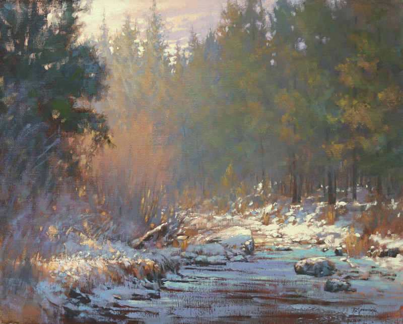
색온도 대비는 현장 습작을 통해 직접 관찰한 것을 바탕으로 그린 '데슈츠 강변의 빛'
(아래, 캔버스에 유채, 24×30인치)에 담을 수 있었습니다.
따뜻한 색과 차가운 색의 대비
화가들은 색온도를 구분하는 데 어려움을 겪는 경우가 많지만, 야외에서 자주 그림을
그리는 화가들은 색온도를 정확하게 표현하는 시각적 감각이 더 뛰어난 경향이 있습니다.
참고 사진은 실제보다 빛을 더 차갑게 표현하고 그림자를 더 어둡게 하는 경향이 있습니다.
하지만 참고 사진에 보이는 색을 그대로 복사하는 것만으로는 설경에서 빛과 그림자가
만들어내는 전체적인 효과를 포착할 수 없습니다.
대부분의 화가에게 목표는 세부 묘사보다는 전체적인 효과를 포착하는 것입니다.
햇빛을 받은 눈은 사진에서 특히 과다 노출된 경우 하얗게만 보이는 경우가 많습니다.
눈에 비치는 강렬한 빛의 눈부신 효과를 표현하려면 따뜻한 색과 차가운 색의 대비를
강렬하게 사용해야 합니다. 사진에서 흔히 과장되는 명암 대비에만 의존하면
그림의 그림자는 너무 어둡고 짙게 보이고 햇빛이 비치는 부분은 밝게 표현되지 않습니다.
명암 대비에 치중하기보다는 색온도 대비를 통해 빛과 그림자를 표현하면 더욱 빛으로
가득 찬 겨울 풍경을 그릴 수 있습니다.
눈을 직접 보고 그리는 것이 눈을 관찰하고 이해하는 가장 이상적인 방법입니다.
야외에서 그림을 그리는 것 다음으로 좋은 방법은 눈 속에서 시간을 보내며
빛과 그림자의 특별한 색감을 관찰하는 것입니다.
그런 다음 실내로 돌아온 직후 스튜디오에서 간단한 습작을 그려보세요.
시연: 빛과 그림자의 정의

장면: 저는 현장에서 이 풍경을 관찰하고 작업실로 돌아온 직후에 그렸습니다.
사진은 눈 위의 빛과 그림자 무늬는 포착했지만, 눈부시게 반짝이는 효과는
제대로 담아내지 못했습니다.
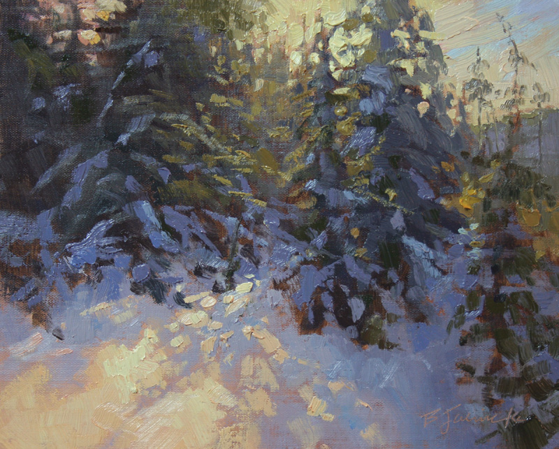
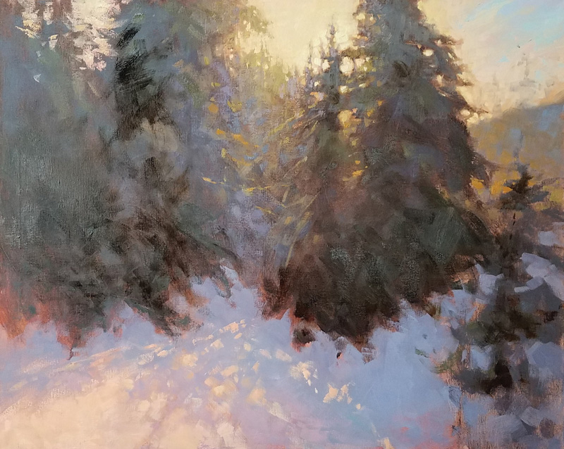
유화 습작: 이 작은 습작, <소나무 그림자>(패널에 유화, 8×10인치)는 제가 그 장소를
방문한 직후 참고 사진을 활용하여 작업실에서 그린 것입니다.
제 목표는 직접 관찰했던 빛과 그림자의 색채 대비를 표현하는 것이었습니다.
이 습작을 바탕으로 아래에서 보시는 것처럼 더 큰 그림을 완성했습니다.
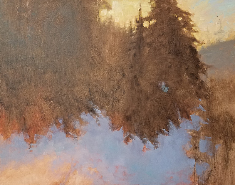
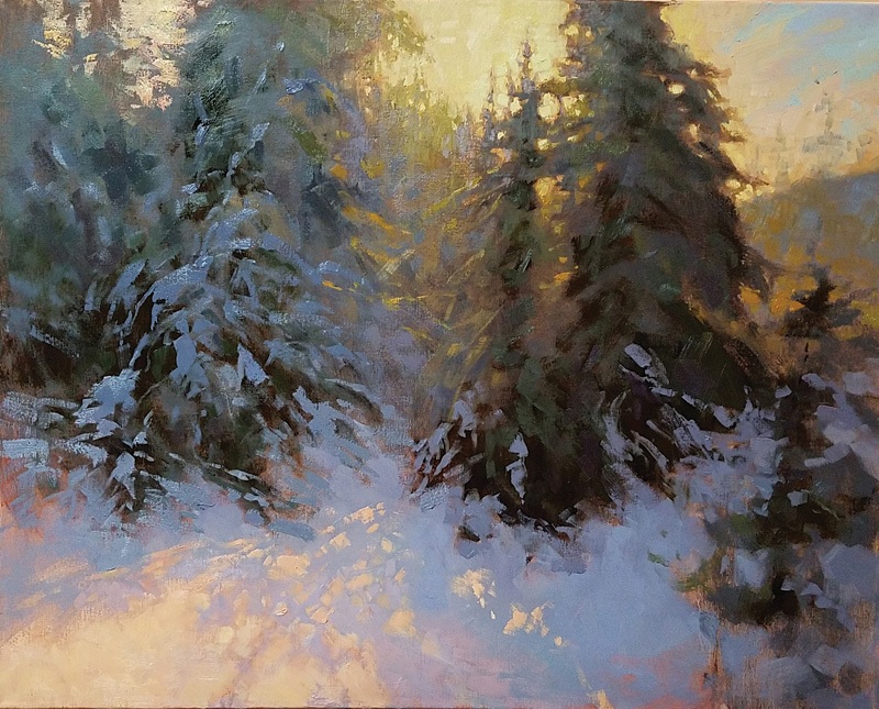
1단계: 명암 구조를 잡은 후, 하늘의 따뜻한 빛과 눈 그림자의 차가운 색을 칠하기
시작했습니다. 하늘 오른쪽 상단의 따뜻한 청록색과 눈 그림자 부분의 차가운 청자색 사이의
색온도 차이에 주목하세요. 이 단계에서 앞쪽의 햇빛을 받은 눈의 색은 캔버스 표면의
따뜻한 색조, 즉 분홍빛을 띤 색입니다.

2단계: 나무 덩어리 내부의 따뜻한 색과 차가운 색을 조절했습니다.
역광이 충분히 투과될 수 있도록 색 값을 밝게 유지하여 빛이 가득한 효과를 더욱 강조했습니다.
3단계: 다음으로, 따뜻한 분홍색과 복숭아색 같은 따뜻한 색조를 사용하여
햇빛에 비친 눈을 표현하기 시작했습니다. 분홍빛을 충분히 사용하여 그림자에서
빛으로 자연스럽게 이어지는 그라데이션을 만들었습니다.
또한 나무의 가장 어두운 부분은 명암을 더 깊게 했습니다.
이렇게 함으로써 역광 효과를 더욱 강조하고 전체적인 명암 범위를 넓힐 수 있었습니다.
4단계: 나뭇가지 위의 눈을 그릴 때, 파란색, 보라색, 청록색 계열을 사용하여
그림자가 드리워진 눈의 색온도가 아래쪽 어두운 나뭇가지보다 더 차갑게 유지되도록 했습니다.
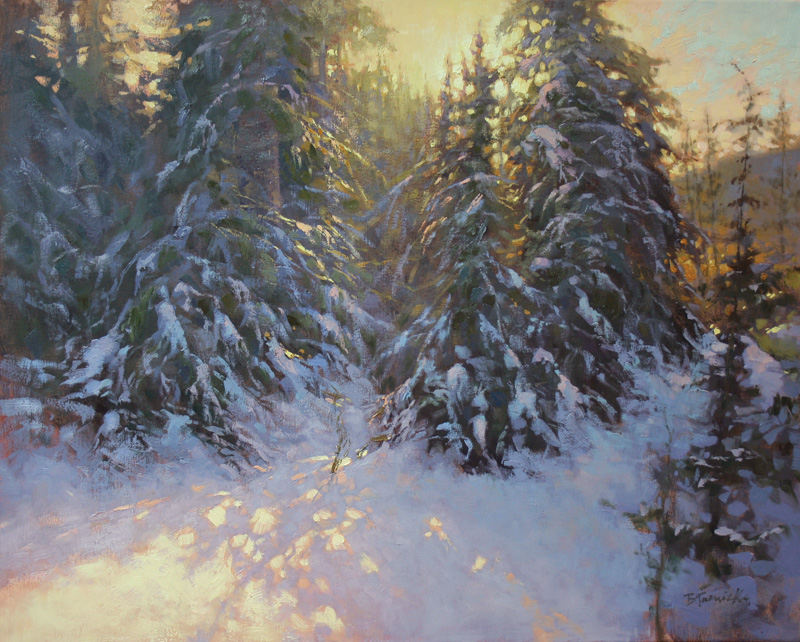
마지막 단계: 레몬빛이 도는 노란색 색조를 사용하여 눈과 하늘에서 가장 밝게 빛나는
부분을 표현했습니다. (만약 저녁 빛이었다면 주황색 색조가 전체적으로 강조되고
하늘과 눈의 레몬빛은 줄어들었을 것입니다.) 그림자가 드리워진 눈과 나무 사이의
어두운 그림자 사이에는 명암 차이가 상당히 크지만, 그림자가 드리워진 눈과 햇빛이
비치는 눈 사이에는 명암 차이가 거의 없습니다.
<새벽의 겨울 그림자>(캔버스에 유화, 24×30인치)에서 눈의 명암 대비를 결정하는 것은
주로 색온도 차이입니다.
--------------------------------------------------
Contrasts are the key to successful landscapes featuring snow.
By Barbara Jaenicke
Most artists agree that snow provides beautiful contrast opportunities for a landscape painting. And, because of its intense reflective qualities, it also allows for the capture of shimmering light and colorful shadows. Even in low light, snow can serve as a dynamic vehicle for dramatic shifts in color temperature.
When we refer to color temperature in the winter landscape, we’re generally speaking of where a color falls on the color wheel—the warm side or the cool side—when defining distinctions between light and shadow. Because snow is highly reflective, temperature contrasts often can appear fairly dramatic.
Warm Against Cool
Artists sometimes struggle to see color temperature, although those who regularly paint outdoors tend to have better visual acuity for temperature accuracy. Reference photos tend to skew light cooler than it actually appears—and to darken the shadows.
By merely copying colors as they appear in a reference photo, however, it’s impossible to capture the overall effect of light against shadows in a snowscape.
For most artists, the goal is to capture the effect rather than record details. Sunlit snow often appears only as white in a photo, especially if that part of the photo becomes overexposed.
To capture the blinding effect of strong light on snow, we have to pair an intensely warm temperature against a cool temperature. If we depend too much on simply using a strong value contrast—which is usually exaggerated in a photo—shadows in the painting will appear too dark and heavy, and sunlit areas won’t appear illuminated. By emphasizing contrasts in color temperature to define light and shadow, instead of placing the emphasis on value contrasts, we can create a more light-filled winter landscape.
Painting snow directly from life is the most ideal way to see and understand it. The next best option to painting outdoors is to spend time being out in the snow, observing the particular colors of the light and shadow. Then, follow that up by painting a quick studio study soon after returning indoors.
The Scene: I observed this view on-site and painted it soon after returning to my studio. The photo captured the light and shadow patterns on the snow, but not the dramatic shimmering effects.
Oil Study: I painted this small study, Pine Tree Shadows (oil on panel, 8×10), in my studio using the reference photo soon after visiting the spot. My goal was to work out the temperature contrasts of the light and shadow effects that I’d observed firsthand. I created a larger painting based on this study, as seen in the steps that follow.
STEP 1: After I blocked in the value structure, I began painting the warm light of the sky and the cool of the snow shadows. Notice the temperature difference between the warm blue-green in the upper right of the sky and the mostly cooler blue-violets in the shadow areas of the snow. At this stage, the color of the sunlit snow in the foreground is just the warm-toned surface of the canvas, which is a pinkish hue.
STEP 2: I adjusted the warm and cool temperatures within the tree masses. I kept the values light enough to allow plenty of the backlighting to filter through, which enhanced the light-filled effect.
STEP 3: Next, I began to address the sunlit snow using warm hues such as warm pink and warm peach. I allowed plenty of the pinkish hue to provide a gradual transition from shadow to light. I also deepened the values for the darkest areas within the trees. This further enhanced the backlighting effect and allowed me to increase the overall value range.
STEP 4: As I painted the snow atop the tree boughs, I made sure to keep the color temperature for the shadowed snow cooler than the dark underlying boughs by using blue, violet, and blue-green hues.
FINAL STEP: I defined the most brightly lit areas of the snow and sky using a lemon-yellow hue. (If this were evening light, orange hues would be emphasized throughout, and the lemon-yellow hue in the sky and snow would likely be decreased.) There’s a fairly large value difference between the shadowed snow and the dark shadows within the trees, but little value difference between the shadowed snow and sunlit snow. It’s primarily the temperature difference that defines the contrast in the snow in Daybreak’s Wintry Shadows (oil on canvas, 24×30).
'그림공부' 카테고리의 다른 글
| ( 그림 공부 ) 예술가를 위한 영감: 학습 곡선(Inspiration for Artists: Learning Curve)) (0) | 2026.02.14 |
|---|---|
| ( 그림공부 ) 현장에서 비행기 그리기 (Painting Airplanes on Location) (3) | 2026.01.23 |
| ( 그림 공부 ) 풍경화 시연: 큰 형태, 대담한 붓놀림(Landscape Painting Demo: Big Shapes, Bold Brushstrokes) (1) | 2026.01.20 |
| ( 그림공부) 분위기 있는 그림을 그리러면 (Exploring Mood in Painting) (6) | 2026.01.10 |
| ( 그림공부 )목탄으로 그림 그리는 방법- How to Draw with Charcoal (0) | 2025.12.18 |


