Inside Art 에 Bryce Cameron Liston 이란 화가가 쓴 글이 있어 옮긴다.
인터넷을 찾아보니 주로 인물화를 그리는 화가인 것 같다.
(번역은 구글 번역, 영어 원문은 맨 뒤에 )
----------------------------------------------
적어도 저에게 그림 그리기는 매우 힘든 작업입니다. 어렵고 고된 작업이지만,
동시에 매우 짜릿하고 보람 있는 일이기도 합니다. 끊임없이 노력하고 배우는 평생의
여정이었죠. 처음 그림을 그리기 시작했을 때는 그리면 그릴수록 쉬워질 거라고 확신했습니다.
스트레스도, 불안도 없이 편안하게 앉아서 한 손을 묶고도 걸작을 그리는 제 모습을
상상하곤 했습니다. 물론 아직 중견 화가이긴 하지만요... 언젠가는 그렇게 될지도 모르죠.
하지만 현명한 사람이 말했듯이 "더 쉬워지길 바라지 말고, 더 나아지길 바라라."
이 말은 제 예술 철학과 완벽하게 맞아떨어집니다. 저는 그림이 쉬워지길 바라는 게 아니라,
더 나아지길 바랍니다. 그것이 제 원동력이자, 집착이자, 고통이기도 합니다.
어렵기 때문에 더욱 보람을 느끼는 거죠. 에드가 드가는 "그림 그리는 법을 모를 때는
쉽지만, 알 때는 매우 어렵다"라고 말했습니다. 드가의 그 말에 담긴 의미를 진정으로
이해하기까지는 오랜 시간이 걸렸지만, 지금에 와서야 그 말이 제게 얼마나 큰 의미를
갖는지 깨달았습니다.
네, 이게 바로 저입니다. 저는 스스로에게 많은 기대를 거는 편입니다.
하지만 모든 사람에게는 각기 다른 목표가 있을 거라고 생각합니다.
예술은 사람마다 다른 의미를 지니고 있죠. 그러니 어쩌면 여러분에게는
그리 어렵지 않을 수도 있습니다. 어쩌면 단순히 취미로만 그림을 그리고 싶을 수도 있겠죠.
그렇다면 그것 또한 멋진 일입니다. 하지만 어떤 단계에 있든, 배움은 필수적인 과정입니다.
누구나 어느 정도는 실력을 향상시키고 싶어 하고, 실력 향상은 결국 꾸준한 연습을
통해 이루어집니다.
스케치하고 그림을 그리는 데 투자하는 시간은 모두 합쳐져 평생의 경험이 됩니다.
특정 분야에서 숙련되기 위해서는 최소 1만 시간은 연습해야 한다고 합니다.
하지만 이것은 경주가 아니라는 것을 기억하세요. 인내심을 갖고 한 획 한 획을
그릴 때마다 배우고 있다는 사실을 깨달으세요.
예술 정신의 본질은 성장하고 배우며, 스스로를 채찍질하여 지식 기반과 기술을 확장하는 데 있습니다.
하지만, 현재 자신의 이해 수준에 맞는 정보만 받아들이고 진정으로 이해할 수 있습니다.
예를 들어, 워크숍에서 열심히 작업하고 있는데 강사가 색온도에 대해 구체적으로
언급했다고 상상해 보세요. 그때 갑자기 깨달음을 얻는 순간이 옵니다.
바로 '아하!' 하는 순간이죠. 모든 게 명확해집니다! 지난 1년 동안 색온도를 정말 열심히
다뤄왔고, 어쩌면 강사가 방금 말한 것과 똑같은 내용을 전에는 전혀 이해하지 못했을지도 모릅니다.
왜 이제야 그렇게 명확하게 이해하게 된 걸까요? 간단히 말해서, 이제 그 정보를 받아들일
준비가 되었기 때문입니다. 그 정보가 현재 자신의 이해 수준에 딱 들어맞는 거죠.
마치 주변을 모두 맞춰야만 제자리에 놓을 수 있는 퍼즐 조각과 같습니다.
저는 학습을 스프링의 나선형에 비유하곤 합니다. 스프링을 타고 나선형으로 올라가다 보면,
다시 같은 지점으로 돌아오지만 한 단계 더 높은 곳에 도달하게 되고,
그곳에서 이전에 배웠던 것을 더 깊이 이해하게 되는 것처럼 말입니다.
우리 모두는 미술의 기본 요소들을 잘 알고 있습니다.
우리는 교육을 시작한 아주 초기부터 이러한 요소들을 접해왔습니다.
수년간 저는 제 작업에 필수적인 열 가지 요소를 정리해 왔습니다.
구도 (디자인)
• 명암 (입체 톤)
• 형태
• 색채
• 가장자리
• 원근법 (선형 및 대기 원근법)
• 질감 (암시적 및 실제 질감)
• 붓놀림
• 해부학적 구조
• 의도/내용 (그림을 그리는 이유)
매년 저는 두 가지 특정 요소에 집중하여 다른 모든 요소보다 우선적으로 개선하려고
노력합니다. 만약 특정 영역에서 충분한 발전을 이루지 못했다고 생각되면,
그 영역을 "개선" 목록에 남겨두고 6개월 또는 1년 동안 더 집중적으로 연습합니다.
명암.
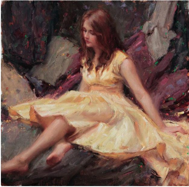
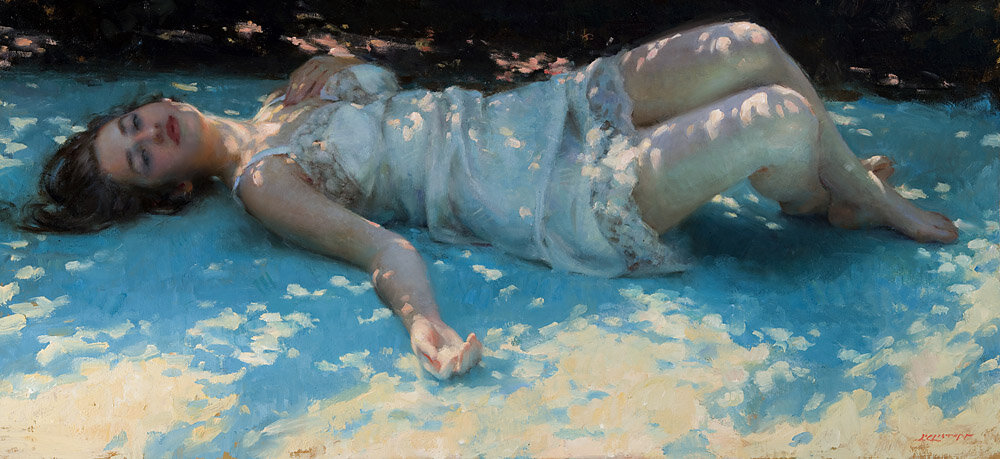
예를 들어, 작년에는 명암과 형태를 "개선" 목록에 넣었습니다. (아래 이미지 1, 2, 3 참조).
명암과 형태는 요소 목록에서 서로 밀접한 관련이 있다고 생각하기 때문에 함께
연습하는 것이 효과적이라고 생각합니다. 그 중요성 때문에 먼저 명암에 대해 이야기해
보겠습니다. 명암이라는 용어는 기본적으로 검정색과 흰색 사이의 회색 단계적 변화를
나타내는 간단한 척도입니다. 하지만 회화에서는 명암을 모아서 표현하면 더욱 강렬하고
통일된 그림을 만들 수 있다는 효과도 있습니다.
하워드 파일은 이를 다음과 같이 설명했습니다. "흰색은 흰색끼리,
중간 톤(그룹)은 회색끼리, 검정색은 검정색끼리, 그리고 시선을 집중시킬 중심에는
검정색과 흰색을 배치하세요."

이 예시에서는 제 그림 '휴식(Repose)'의 이미지를 두 가지 값으로만 축소했습니다.
이 값들이 밀집되어 있는 것을 주목해 보세요. 모든 빛이 그림 중앙에 모여 있습니다.
이는 흥미로운 추상적인 형태를 만들어내지만, 저는 균형이 잘 잡혀 있다고 생각합니다.

이 예시에서는 이미지에 동일한 작업을 세 가지 명암으로 적용했습니다.
좀 더 사실적으로 보이지만, 그림 전체적인 구성은 여전히 훌륭합니다.

이 예시에서는 이미지에 동일한 작업을 세 가지 명암으로 적용했습니다.
좀 더 사실적으로 보이지만, 그림 전체적인 구성은 여전히 훌륭합니다.


이 그림은 같은 그림을 흑백으로 표현한 것입니다. 색을 모두 제거해도 형태와 명암 덩어리가
잘 어우러져 여전히 강렬한 인상을 줍니다.
간단하죠? 생각보다 어렵습니다. 하지만 저는 꾸준히 연습하고 있습니다.
명암에는 다른 중요한 요소들도 있습니다. 올해 제 목표 중 하나는 가능한 한 적은 명암을
사용하는 것입니다. 하워드 파일이 아주 멋지게 말했죠. "두 가지 명암만으로 그림을 그릴 수 있다면,
강렬하고 인상적인 그림이 됩니다. 세 가지 명암을 사용해도 괜찮지만,
네 가지 이상의 명암을 사용한다면, 그 그림은 버려야 합니다."
음, 조금 냉정한 표현일 수도 있지만, 좋은 목표인 것 같습니다!
명암에 대한 마지막 생각입니다. 색에 너무 몰두하기 쉽습니다.
하지만 모든 색에는 흑백 명암 스케일에서 대응하는 명암이 있다는 것을 기억하세요.
적절한 색과 색온도를 사용하면 적절한 명암이 나온다는 말이 있습니다.
저는 그 말에 완전히 동의하지는 않습니다. 명암만 잘 맞추면 어떤 색이든 표현할 수 있다는 걸
알게 됐어요. 아마 사람마다 타고난 감각 때문일지도 모르겠어요.
하지만 색은 굉장히 주관적이고 사람마다 다르게 인식된다고 생각해요.
우리의 지각, 현재 기분, 심지어 유전적인 요인까지 영향을 받죠.
반면 명암은 흰색과 검은색 사이의 단순한 단계적 변화일 뿐이에요.
형태
형태는 꽤 직관적이라고 생각해요. 어떤 사물이든 본래의 형태에 집중하고
최대한 단순하게 표현하려고 노력하면 돼요. 원, 사각형, 삼각형을 떠올려 보세요.
그리고 특정 사물이 무엇인지 생각하기보다는 "어떤 모양일까?"라고 생각해 보세요.
형태는 인체를 그릴 때 매우 중요한 역할을 한다는 것을 기억하세요.
팔은 팔이 아니라 원기둥이에요. 형태에 대해 두 가지 더 말씀드리고 싶은 점이 있어요.
형태에 변화를 주고, 동시에 음영 공간(이것도 형태입니다)에도 주의를 기울이세요.
제가 여러분께 전하고 싶은 메시지는, 우리가 얼마나 발전했든, 혹은 앞으로 얼마나
더 나아가야 하든, 우리는 모두 여전히 배우고 있다는 것입니다.
오늘날의 거장들조차도 여전히 배우고 있습니다.
그들이 모든 것을 너무나 쉽게 해내는 것처럼 보이는 것은, 그들이 마침내 올바른 길을 찾기까지
수천 번의 시행착오를 거쳤기 때문입니다.
제가 가장 좋아하는 명언 중 하나는 이 점을 명확히 이해했던 한 거장의 말입니다.
위대한 에드가 드가는 임종을 앞두고 예술가로서의 배움을 끝낼 수 있는 것은
오직 하나뿐이라는 것을 깨달았습니다. 삶의 마지막 순간들이 흘러가고 죽음이 다가오는
것을 느끼며, 그는 "젠장, 이제 막 깨닫기 시작했는데."라고 말했다고 전해집니다.
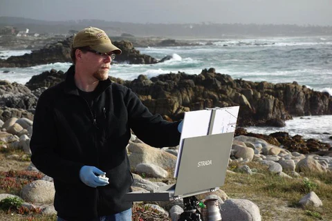
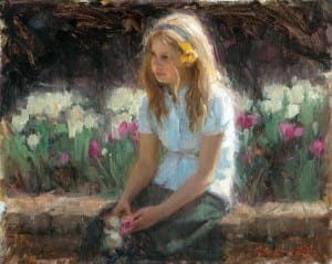
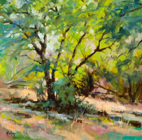
(이 화가의 그림 몇 점 )


Painting, at least for me, is a very demanding discipline. It’s difficult and exhausting, but at the same time very exhilarating—and certainly rewarding. It’s been a lifetime endeavor of constant striving and learning. When I first began to paint I was sure it would get easier the more I did it. I could envision myself sitting back with ease just painting away, no stress, no anxieties, painting a masterpiece with one hand tied behind my back—so to speak. Okay, granted I’m still mid-career so who knows . . . maybe someday. But as a wise man once said “Don’t wish it were easier, wish you were better.”
This thought completely fits my philosophy of art. I don’t really want it to get easier—I just want to get better. That is my drive, my obsession, and my torment. It’s rewarding because it’s so difficult. Edgar Degas said, “Painting is easy when you don’t know how, but very difficult when you do.” It took many years before I truly understood what Degas meant by that statement, but how profound it is to me now.
Okay, so that’s me. I place a lot of expectations on myself.
I really think it’s very different for everyone out there; we’re not all after the same goals. Art means something different to everyone. So maybe it doesn’t have to be that difficult for you. Perhaps you only want to do it as a hobby—if so, that’s fantastic. However, at whatever stage you are in your journey, learning is an essential part of it. Everyone wants to improve to some degree, and in order to improve it really does come down to the mileage that you cover.
Time spent sketching and painting all adds up to a lifetime of experience. It takes a minimum of 10,000 hours of practicing a specific task to become proficient at it. But also remember it’s not a race. Find your patience and realize you are learning with every stroke. The essence of the art spirit is to grow and learn and to push yourself to expand your knowledge base and skill set.
With that said, you can only take in and truly comprehend information that corresponds with your current level of understanding. For example, imagine you are sitting in a workshop working away when the instructor mentions something specific about color temperature. And then it hits you; it’s that genuine A-ha! moment. Things are so clear now! You’ve been working with color temperature so hard for the last year, and maybe you even read the exact same thing that the instructor just said, but before it just didn’t sink in.
Why is it that you now understand it so clearly? It’s simply because you are now ready for the information. It fits in with your current level of understanding. It’s like a puzzle piece that you can’t place until you have the surrounding area filled in. I like to think of learning as being like the spiral of a spring. As you go up the spiral, around the spring, you come back to the same spot but on the next level up, and you understand more deeply what you learned at that same spot the last time around.
We’re all familiar with the elements of art. They’ve been presented to us since the very beginning of our education. Over the years I have developed a list of ten elements that are essential to my work.
- Composition (design)
• Value (mass tone)
• Shapes
• Color
• Edge
• Perspective (linear and atmospheric)
• Texture (implied and actual)
• Paint handling
• Anatomy
• Intent/Content (the “why” of painting)
Each year I focus on two specific elements and work to improve them above all others. If I feel I haven’t made enough progress in an area I will just leave it on my “Improve” list and work on it for another six months or a year.
Value.
For example, this past year I put value and shapes on my “Improve” list. (Images 1, 2, 3 below). I see value and shapes as being close friends on the elements list so it makes sense to work on them together. Because of its importance, let’s first talk about value. The term value is basically a simple scale of gradations of gray between black and white. But in painting terms, there is also the effect of massing your values for a stronger and more unified painting.
Howard Pyle once explained it like this: “Put your white against white, middle tones (groups) against grays, black against black, then black and white where you want your center of interest.”
In this example, I reduced an image of my painting Repose down to two values only. Notice the tight grouping of these values—all the lights are grouped together in the center of the painting. It makes for some interesting abstract shapes, but I feel it is well-balanced
In this example, I have done the same thing with the image but now in three values. It takes on a little more reality, but again the painting holds together quite well
In this example, I have done the same thing with the image but now in three values. It takes on a little more reality, but again the painting holds together quite well.
This is the same painting in black and white. With all of the color removed, it still makes a strong painting because the shapes and value masses are well grouped.
Simple, right? It’s harder than you think, but I’m working on it. There are also other very important aspects to value. Using as few as possible is definitely one of my goals this year. Again Howard Pyle said it so eloquently: “If you can make a picture with two values only, you have a strong and powerful picture. If you use three values, it is still good, but if you use four or more, throw it away.”
Okay, maybe that’s a bit harsh, but it’s a good goal!
One last thought on value. It certainly can be easy to lose oneself in color. But remember that every color you put down has a corresponding value on the black-and-white value scale. It has been said that if you lay down the right color and temperature you will have the proper value. I guess I don’t quite see it that way. I learned that if you get your value correct you can put down any color. I think it might just be the way we are each wired. But I believe color is very arbitrary and seen very differently by everyone. It is influenced by our perceptions, our current moods, and even our genetics. But values are a plain and simple gradation between white and black.
Shapes
I guess shapes are pretty straightforward. Just remember to pay close attention to any object’s inherent shape and try to keep it simple. Think circles, rectangles, and triangles. Also, try not to think of what a specific object is, instead think, “What shape is it?”
Remember, shapes play an extremely important role when it comes to working with the figure. An arm is not an arm, but a cylinder. There are two other aspects to shapes that I should mention as well. Be sure to give shapes a little variety and at the same time pay attention to the negative spaces—which are shapes too.
So what I want to impart is that no matter how far we’ve come or how far we have to go, we’re all still learning. Even the contemporary masters of today are still learning. And when you think they make it look so easy, it is only because they have made the same mistake a thousand times, before they finally got it right.
One of my favorite quotes is from a past master who understood this clearly. On his deathbed, the great Edgar Degas realized that only one thing could end his learning as an artist. As the final hours of his life slipped past, and he sensed death approaching, he is reported to have said, “Damn, and just when I was starting to get it.”
'그림공부' 카테고리의 다른 글
| ( 그림공부 )추상 미술에 대한 진실 - The Truth About Abstract Art (1) | 2026.02.20 |
|---|---|
| ( 그림공부 ) 그림에 자유로움을 더하는 방법 (구조 vs. 즉흥성) How to Loosen up Your Paintings (structure vs spontaneity) (3) | 2026.02.18 |
| ( 그림공부 ) 현장에서 비행기 그리기 (Painting Airplanes on Location) (3) | 2026.01.23 |
| ( 그림공부 ) 눈(snow)을 잘 그리는 방법 (3) | 2026.01.22 |
| ( 그림 공부 ) 풍경화 시연: 큰 형태, 대담한 붓놀림(Landscape Painting Demo: Big Shapes, Bold Brushstrokes) (1) | 2026.01.20 |


