
Shari Blaukopf라는 캐나다 수채화가의 글을 옮긴다.
(번역은 구글 번역, 원문은 맨 뒤에)
다채로운 색깔과 모양의 농산물을 발견해 보세요. 먹을 수 있는 것도 있고,
스케치 소재로 활용할 수 있는 것도 있습니다.
저는 매일 스케치하는 것을 적극 권장합니다. 연필, 펜, 붓을 종이에 대는 횟수가 많을수록
실력이 향상되기 때문입니다. 그리고 스케치를 자주 할수록 일상생활의 필수적인 부분이 되어,
그 만족감 때문에 포기하고 싶지 않게 됩니다.
물론, 바쁜 일상 때문에 매일 스케치를 하기는 쉽지 않습니다.
하지만 저는 손이 닿는 곳에 있는 소재를 활용하면 훨씬 쉽게 스케치를 할 수 있다는 것을
알게 되었습니다. 주방 카운터 위의 과일 바구니와 냉장고 야채칸보다 더 손이 닿는 곳이 있을까요?
바로 그곳에서 스케치하기 좋은 소재를 발견하곤 합니다.
멍들고, 시들고, 조금 싱싱해 보인다고요? 오히려 더 좋습니다!
이러한 생각은 제가 장을 볼 때도 적용됩니다. 저는 메뉴에 맞는 재료뿐만 아니라
스케치 소재로 활용할 수 있는 신선한 농산물을 고르는 습관을 들였습니다.
과일과 채소가 구도, 색, 형태, 그림자, 빛에 대해 생각하는 데 도움이 되는 7가지 방법을 소개합니다.
1. 현명한 쇼핑
저는 작업실 용품을 살 때 부엌 용품도 함께 삽니다. 스케치와 요리는 모두 변화를
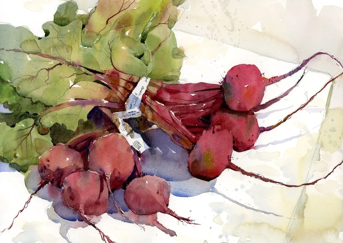
가져오는 활동이니까요. 짙은 붉은색의 뿌리와 길고 뾰족한 줄기를 가진 비트는
제가 가장 좋아하는 소재 중 하나입니다. 잎이 달린 비트를 구할 수 있다면
스케치에도 요리에도 더할 나위 없이 좋죠. 저는 비트의 어두운 흙빛 색조와 대비를
이루도록 묶은 끈을 그대로 둡니다. 비트 특유의 붉은색을 내기 위해 알리자린 크림슨을
기본 색상으로 사용하고, 여기에 초록색과 노란색을 조금씩 더하고,
가장 어두운 부분에는 보라색을 살짝 넣어줍니다.
2. 내면의 아름다움 찾기
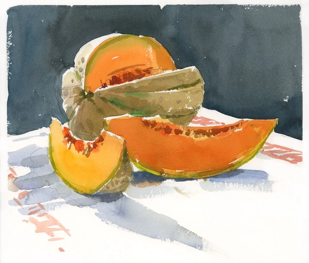
이 탐스러운 멜론을 자르던 중 문득 이 모습을 그림으로 그려야겠다는 생각이 들었습니다.
그래서 천을 깔고 서둘러 작업실로 달려가 물감을 가져왔죠.
완벽한 구도를 잡기 위해 저는 항상 준비된 물체 주변을 걸어 다니고, 앉았다 일어섰다 하고,
이리저리 기대보기도 합니다. 이번에도 마찬가지로 여러 가지 자세를 취해 보았고,
멜론의 진한 색감을 제대로 표현하기 위해 물감이 신선하고 싱싱한지 확인했습니다.
또한, 잘 익은 과일의 밝은 주황색과 대비되도록 배경에는 짙은 청흑색을 칠하는 예술적 시도를 더했습니다.

3. 빛을 기다리며
제가 배를 그린 횟수는 셀 수 없을 정도입니다. 탐스러운 아랫부분과 구불구불한
줄기는 그리는 즐거움을 더해줍니다. 이 스케치를 위해 저는 오후 햇살이 부엌 창문으로
들어오기를 기다렸습니다. 그리고 배 다섯 개(홀수 개일수록 구도가 더 좋죠)를
카운터 위에 올려놓았습니다. 그림자가 계속 움직일 것을 알고 있었기에,
시각적 일관성을 위해 먼저 과일을 그리고 그림자 형태를 한 번에 담아냈습니다.
4. 과일 그릇의 틀을 벗어나 생각하기
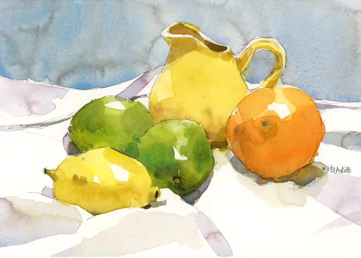
저는 오랫동안 화가 찰스 리드를 동경해 왔습니다. 그는 가정용품과 과일이나 꽃을
기발한 방식으로 섞어 마치 모든 것이 그냥 아무렇게나 던져진 것처럼 보이게 하는 재주가
있었죠. 크기가 거의 비슷한 이 감귤류 과일들을 배치하면서 문득 리드가 떠올랐습니다.
리드를 생각하며, 앞쪽 레몬의 밝은 노란색과 어울리도록 작은 노란색 크리머를 집어 들었습니다.
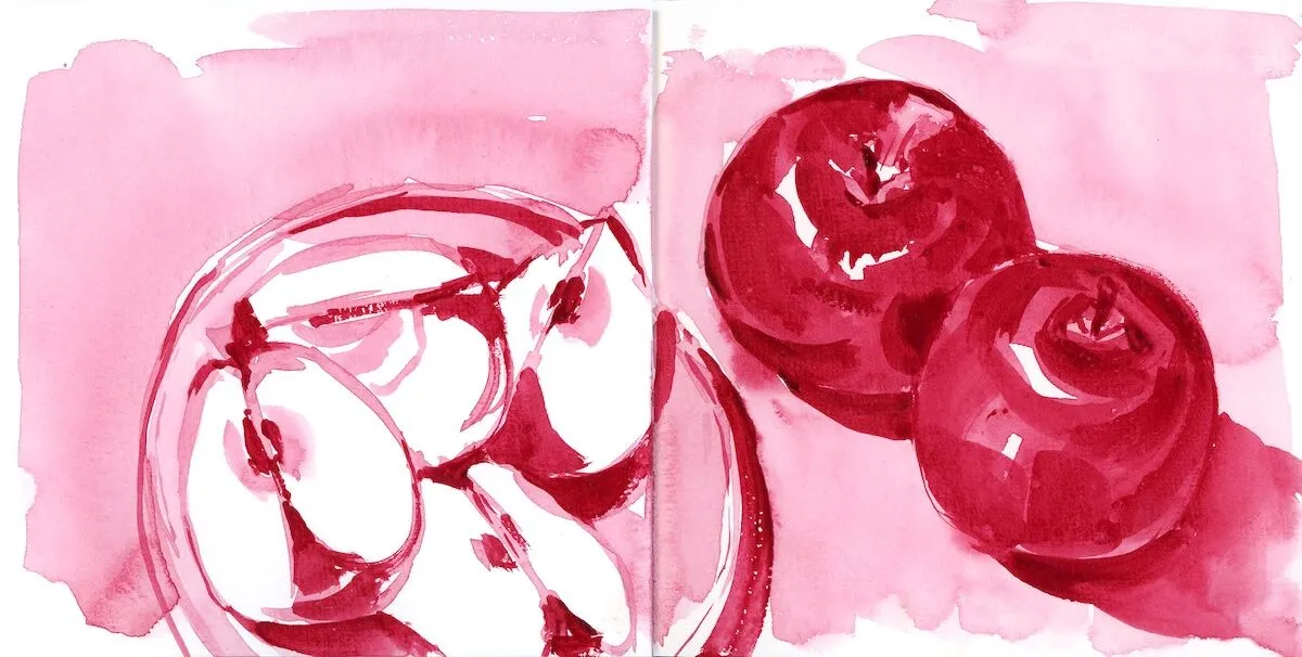
5. 색상 실험하기
새로운 안료를 테스트할 때는 종종 단색 스케치부터 시작합니다.
그렇게 하면 표현할 수 있는 밝은 색부터 어두운 색까지의 전체 범위를 확인할 수 있습니다.
여기서는 물감 서랍에 있는 진홍색 수채 물감과 과일 바구니에 있는 사과 몇 개를 함께
사용해 보았습니다. 그 색이 너무 마음에 들어서 작업실 팔레트와 휴대용 팔레트 모두에 고정적으로 포함시켰습니다.
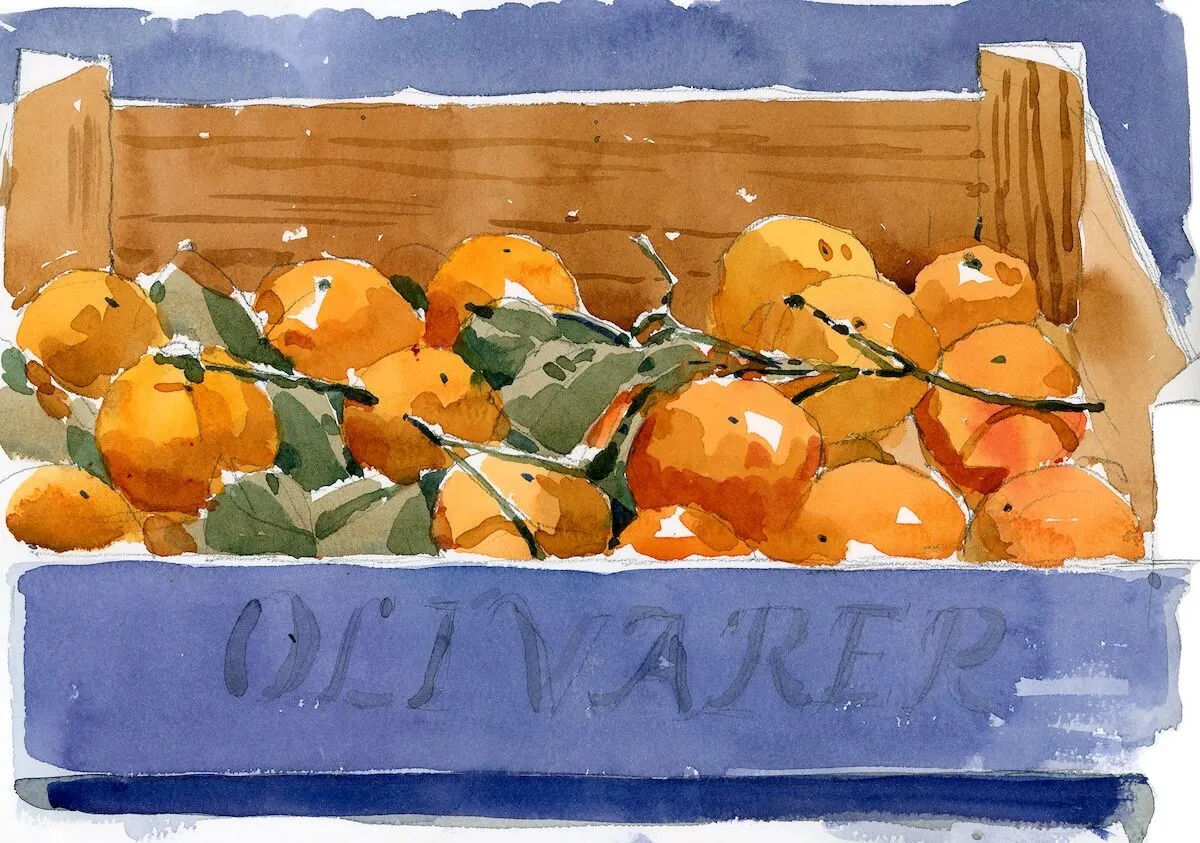
6. "꽉 채워 넣기"
배와 사과처럼 클레멘타인도 제 스케치북에 자주 등장합니다. 특히 껍질의 오돌토돌한
질감과 윤기 있는 잎이 그대로 붙어 있는 모습이 멋진 대비를 이루는 것이 좋습니다.
제철에는 장난감처럼 생긴 나무 상자에 담겨 판매되는데, 이 상자는 보기에도 좋고
스케치 소재로도 훌륭합니다. 생각해 보세요, 이렇게 밝은 주황색, 초록색, 보라색의 과일들이
작은 나무 상자에 담겨 있는 모습을 얼마나 자주 볼 수 있을까요?
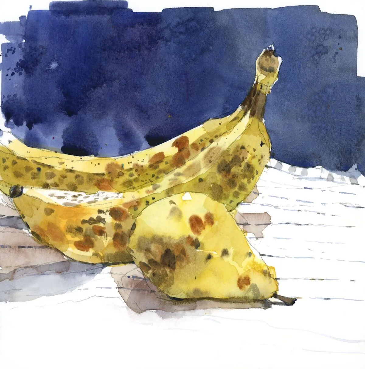
7. 불완전함을 받아들이기
어느 날, 감을 사서 서둘러 집에 와서 그림 그리는 책상 위에 가지런히 놓았습니다.
주황색에 윤기가 흐르고 완벽해 보였지만, 너무나 지루했습니다.
그때 어제 점심 도시락에 들어있던 얼룩덜룩하고 멍든 배가 눈에 띄었습니다.
스무디나 케이크에 쓰일 갈색 바나나는 어떡하지? 완벽함보다는 썩어가는 모습이
더 흥미롭다는 생각에, 저는 이렇게 싱싱하지 않은 과일들을 그리고 나서 감을 먹기로 했습니다.
====================
Discover the variety of color and shape in produce—some of it edible, all of it sketchable.
By Shari Blaukopf
I’m a big believer in daily sketching, because the more often you put pencil, pen or brush to paper, the more you improve as an artist. And the more often you sketch, the more it becomes an essential part of your day—so satisfying, you don’t want to give it up.
Of course, life often gets in the way of daily sketching, but I’ve found that by reaching for subjects close at hand, it’s far easier to get some sketching in. And what’s closer at hand than the fruit bowl on my counter and the crisper drawers in my fridge? That’s where I often find the best subjects for sketching. Bruised, faded, a bit past their prime? Even better!
This mindset carries over into the way I shop, too, as I often find myself choosing produce that will not only fit my menu, but will also “sit” for my sketches. Here are seven ways that fruits and vegetables help me think about composition, color, shape, shadow and light.
1. Shopping Smart
When I go shopping for my studio, I’m also shopping for my kitchen—and vice versa. Sketching and cooking are, after all, both transformative. With their deep red taproots and long spiky tails, beets are one of my favorite subjects. If I can find a bunch with leaves attached, so much the better—for both sketching and cooking. I leave the twist ties on for contrast against the dark, earthy hues. To get that distinctive beet red, I start with alizarin crimson as the main color, to which I add touches of green and yellow, plus some purple for the darkest areas.
2. Finding the Beauty Within
I was partway through cutting up this juicy melon when I realized that I had to paint it, so I set up a cloth and dashed to my studio for paints. To get the right composition, I always walk around my arrangement, sit, then stand, then lean this way and that. I did all these things, and made sure my paints were fresh and juicy in order to capture the deep melon color. I also took some artistic license with the background by creating a deep blue-black wash to offset the bright orange of the ripe fruit.
3. Waiting for the Light
I can’t count the number of times I’ve painted pears. Their voluptuous bottom-heavy shapes and twisted stems make them so satisfying to draw. For this sketch, I waited for the afternoon sun to arrive at my kitchen window. Then I set up my five pears (odd numbers always make for better compositions) on the counter. I knew that the shadows would keep moving, so—for visual consistency—I painted the fruit first and captured their shadow shapes in one go.
4. Thinking Outside the Fruit Bowl
I’m a longtime admirer of the painter Charles Reid, who had an eccentric way of mixing household objects with fruit or flowers—and somehow made it look like everything was just thrown together. He came to mind as I was setting up these citrus fruits, which were all pretty much the same size. Thinking of Reid, I reached for a small yellow creamer to add a bit of height and to echo the bright yellow of the foreground lemon.
5. Experimenting With Colors
When testing new pigments, I’ll often start with a monochrome sketch. That way, I’m able to see the full range of light-to-dark tones that I can achieve. Here, I paired a tube of carmine watercolor from my paint drawer with some apples from my fruit bowl. I liked the color so much that I gave it a permanent spot in both my studio palette and my travel palette.
6. “Packing” It In
Like pears and apples, clementines show up in my sketchbook a lot. I like them especially with their waxy leaves still attached, which make a great contrast to their pebbly peel. When in season, they’re sold in toylike wooden boxes that are both handsome and useful as a compositional element. When you think about it, how often do you get bright orange, green and purple elements packaged in a tiny wooden crate?
7. Embracing Imperfections
One day, I bought some persimmons and rushed home to arrange them on my drawing table. They were orange, shiny, perfect—and utterly boring. That’s when I noticed a pear, mottled and bruised and left over from yesterday’s lunch bag. And what about those brown bananas, destined for smoothies or some kind of cake? Since decay is always more interesting than perfection, I chose to draw these past-their-prime fruits and then eat the persimmons.
'그림공부' 카테고리의 다른 글
| ( 그림공부 ) 실제 경치와 그림의 비교 (2) | 2026.04.05 |
|---|---|
| ( 그림공부 ) 봄철 미술 활동을 위한 10가지 팁 (0) | 2026.04.05 |
| ( 그림공부 ) 내면의 영감의 불꽃-The Spark of Inspiration Within (0) | 2026.03.05 |
| ( 그림공부 )추상 미술에 대한 진실 - The Truth About Abstract Art (1) | 2026.02.20 |
| ( 그림공부 ) 그림에 자유로움을 더하는 방법 (구조 vs. 즉흥성) How to Loosen up Your Paintings (structure vs spontaneity) (3) | 2026.02.18 |


